Rating art honestly


43 comments
slomonoodles[OP]
04.08.2019 19:07
LinkI'm really picky when I'm honest, just warning u
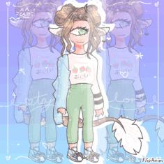
1st one: 8/10
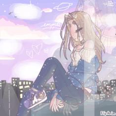
2nd: 7/10
Both are very cute drawings, they include many colors and gradients which is time consuming. It looks like you put substantial effort in both. Both have smooth lines, so much detail and pretty shadow/highlights. The anatomy is good, her figure isn't crooked or anything. For the second one, the buildings in the background are sloppy, so it takes away some of the beauty. But,, it has more of an aesthetic feel to it. The outfit color and designs for both are pretty nice.
Sorry took a long time to type lol
4.5/10
I like your effort of shading and highlighting with opacity, at least I think you used opacity. The neck is long. Grass and leaves on trees don't look like that, but I understand that you might have not wanted to be to detaily and put extra effort into the background. The shading for the apples is wrong, since apples are round. You would need to shade it roundedly. The anatomy is just no, but I'm not sure if it's your style to make it too realistic or not so let's leave that off. I also dislike when people make heads bigger than bodies when that's not how it's supposed to be but its a habit for some so you'll need to fix that. I like how you tried and did your best.
Comment removed
Ok ma dude
remember, I'm picky
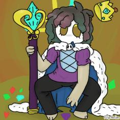
4.9/10
Good, but it's better if you smoothen out your lines, anatomy is awkward, because the left leg is facing the whole opposite direction from his other leg while he's squatting, so it's making me wonder how he can balance(maybe with the staff). Don't be afraid to put lotsa shading and details, it might take a long while, but it's worth it. Also it'd be better if you'd not put lines in the fur of his cape but shade in to look like it's fluffy. This occurs in the gem attached to the staff too. For the gem, try using a thin px or the smallest size px to draw the edges on the gem. Shape of the crown isn't right, you need to make it round. Places in the body need to be thicker than other places, you drew the same thickness for the entire body. For instance, places like near the wrist, neck, waist, ankles, fingers, and toes. But I think that's part of anatomy oops
Of course, you can attach two if you'd like.
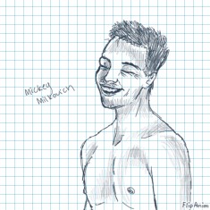
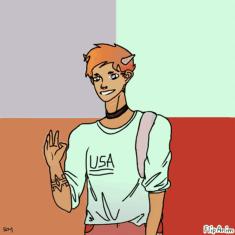
6.1/10 if look at in black and white perpective, no color, no background.
5.3/10 if i look at my normal picky perspective whatever that is haha.
Ok first perspective, what i mean in this perpective is that I'm judging it as black and white art w/no color and what Will Smith looks like. Pretty good, semi-pointy ears, and somewhat reminds me of him. He's a bit too skinny because you shaded a little tad too much under the cheekbones. His upper lip is less big, more like it's spread out. It's the same for the nose, his nose is more flat as he smiles, so you would have the make the shadow appear farther away from eachother at the nose part. --ok I'll just skip all that and tell you how too improve. First of all, you need to draw the person's face according to their facial features and shapes. You also need to use right tools, techniques/strokes and sizes of tools that will make something look like what you're drawing. It's really hard, I know to do all that complic
Ack sry, didn't see this.
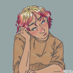
First one, 4.8/10
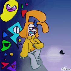
second one, 3/10
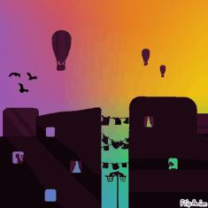
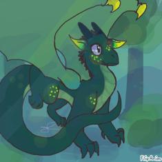
third, 4.9/10
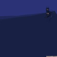
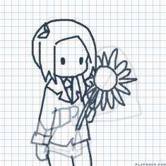
It would be better if you make your lines smoother and when you make straight lines where you don't intend to, like the sleeve in the first anim, redo them, you'll learn more by fixing and slowly adapt to it. You can also make use of using bigger or smaller tool sizes/px for the lineart in first drawing. More shading and lighting on the sweater, sweatpants and skin would be nice(first pic). Since the light is changing in the background you should adjust it to make it change on the person on the rocks too, bc they're exposed to the light and not behind the rock away from the light. But do it only slightly, because you're kinda far away from the changing light. If you want to, then make wrinkles at the waist of the sweater and other places that bend in to make it look like its a sweater. For second anim, I would've made the window corners sharper by zooming in to do that, because windows usually have sharp edges. The second drawing i
-sn't too amazing because it only consists of an easy to make gradient background and one-color buildings with purple lighting/and other black things to add detail/life. I noticed that the lamp post under the clotheslines is sort of sloppy and the clothes, so I suggest you put more effort into it. Since it's a drawing that only uses one color for the main thing, at least make the shapes real good, so it's not just decent. Corner of buildings are pointy so don't just use the big px to draw buildings, use small px to draw corners. Third one is best bc it looks like the most effort was poured into it, excepttt that there is little to no shading on its body.
Ok the biggest thing to improve on is put more effort.
Oh yeah, it's the same for my ipad, no zooming, no nothing.
Maybe you should draw on a bigger device if you got one, or maybe steal your siblings stuff, convince your parents(doesn't work for me but yknow, chances). It's pretty hard to draw on a phone, so drawing at the rate of you drawing on a phone would mean you could draw better.

