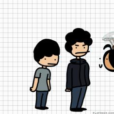
foofy hair beware
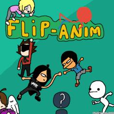
FlipAnim.......thingy idk XD
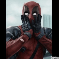
Deadpool
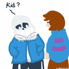
I Have Eyes!
Character Creator ||Flipanim||
武俠01
valentine's cat
Ill rate your art?


92 comments
FennecZeon[OP]
24.03.2021 20:42
LinkThis is just gonna be opinion based sobs

FennecZeon[OP]
24.03.2021 20:43
LinkJust attach some of your art

8/10
For the first one the eyes are to big for the head
I can tell you were going for a realistic style but of it were in a normal art style than I wouldn't mention it
When looking at a picture should go somewhat behind the neck not right at the neck so have the shoulders end higher up the neck to show that
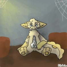
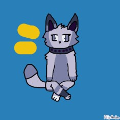
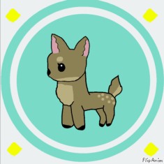
For the second I like the style used for the character but since the char has darker colors I would suggest a lighter background so the colors don't get muddled V cool tho
Comment removed

8/10
Like ive said before I love your art style
For the first I love everything besides the anatomy sobs
The arms are to short. Just imagine the arms you're drawing to fall to the sides and see if they'd end up a litter above the knees, lower, or higher. The correct anatomy is above the knees but bellow the crotch

8/10
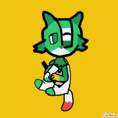
Love the use of color in the backgrounds except for the last one. The green is to vibrant in the last one and clashes with the neon pink or red (I can't tell cause nighttime filter on) on the oc. I would use some time of blue but if you wanted neon then use a neon teal. Most of them have similar body positions so change it up a bit see what you can do.

7/10
Ok I'm very glad you used the lighting the right way so I like that.
The eyes on the first one are to dark on the edges and the one farthest away is To small.
All have similar backrounds and the 3rd ones type background dosent clash well with the characters
I can see what you were trying to do but the lines are to uneven and spread apart
Other than that you understand the concept of lighting which is good and will help you a lot when you start to shade more
