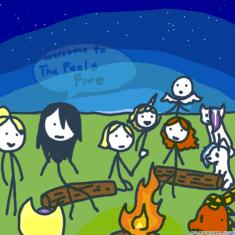
- create flipbook animations online!
Login
lemme give you art tips
GIF
Report
09.02.2019
26 comments
09.02.2019 17:04
Link
Report
Is this comment inappropriate? Report it?
Yes
No
Thank you!
Ok w a i t
09.02.2019 17:04
Link
Report
Is this comment inappropriate? Report it?
Yes
No
Thank you!
E
09.02.2019 17:21
Link
Report
Is this comment inappropriate? Report it?
Yes
No
Thank you!
The animation is a bit too fast, so try to slow it a bit down in the future. The lighting in the background is a bit green rather than the tended color. So I suggest using a very grey yellow and make sure it's sort of bright. In some frames the lineart clips, so before publishing clean up them up. In one frame the back ear is goes over the horn near the right ear, so double check that. In a another frame a part of asriel's face is yellow, probably dues to forget to color it in, and in another frame asriel's upper body behind the flowers his body disappears so check that. For a flow animation it's quite good but there is no where for a proper breeze like that. The lineart clips a lot so try to fix it before publishing. The hands are eh, one is really big then you got a really small, so try to fix it up. The ears bit too big so try shortening it. The horns are constantly move despite being something that doesn't low in the wind so make sure the horns stay still.
09.02.2019 17:23
Link
Report
Is this comment inappropriate? Report it?
Yes
No
Thank you!
K
09.02.2019 17:04
Link
Report
Is this comment inappropriate? Report it?
Yes
No
Thank you!
yEeTuS
09.02.2019 17:10
Link
Report
Is this comment inappropriate? Report it?
Yes
No
Thank you!
The line art is bit messy, So when done the lineart clean it up a bit. The coloring as a few spots. so before publishing and done with the background make sure to fill in the spots. The eyes are clipping through the hair and a bit too big. ABout the hair clipping it looks fine it's just the eye(on the right) is clipping through the hair and off the head. The anatomy is eh, the body is bit too thin(Unless she is a skinny person). The shoulders are bit small to hold the body. The breasts are bit too lowered so try to rise them up a bit. The hand is ok. The finger a just little nubs so try making them a bit longer. The arm doesn't look like it can go into the shoulder because the shoulder is small compared to the hand. Hope that helps ^^
09.02.2019 17:10
Link
Report
Is this comment inappropriate? Report it?
Yes
No
Thank you!
okie ty :3
09.02.2019 17:04
Link
Report
Is this comment inappropriate? Report it?
Yes
No
Thank you!
I'm not the best at art, but I know how to improve it, so I'll help others improve as well ^^
09.02.2019 17:04
Link
Report
Is this comment inappropriate? Report it?
Yes
No
Thank you!
hhh
09.02.2019 17:38
Link
Report
Is this comment inappropriate? Report it?
Yes
No
Thank you!
The lower body (the semi circle near the arm on the right) just seems out of place and looks like it doesn't belong, so when drawing furries try lowering it a bit. The paw on the left wrist is very small compared to the paw and the forearm, so try to thicken it a bit. There is a lack of shading despite being lighting, so try to add shading, just search up speedpaints of furries and study the shading. The lighting feels a bit bland, so besides using white try using a light purple. The flower looks lazy, It has four petals and no stigma or pollen, so try to add more petals around the flower and try to add some stigma and pollen to then flower. The white around thetaco doesn't fit the drawing, so instead of using white try to use a light pink or purple, and if it's another color try to use a color close to it e.g pink to purple and reverse, blue and purple, red and orange/orange red, yellow and a yellowish green and ect. The nose is bit too bright, so I suggest make it dark, e.g just search up animal noses.
09.02.2019 17:41
Link
Report
Is this comment inappropriate? Report it?
Yes
No
Thank you!
alright thanks.
09.02.2019 17:05
Link
Report
Is this comment inappropriate? Report it?
Yes
No
Thank you!
I dunno
09.02.2019 17:52
Link
Report
Is this comment inappropriate? Report it?
Yes
No
Thank you!
The anatomy is eh, like the neck is fine but the head is a bit too big and the shoulders are very small, so trying to make the shoulders a bit broad and big, but not too much, and try studding how the neck goes into the shoulders. The shading looks a bit poor so try using greys(129-139) with the paint roller. The purple is confusing me, is it a bruise? a scar? I don't know but it feels out of place. The eyelashes are a bit too big so try to smallen them up. The affects around the character doesn't go with the background e.g it just feels like it's just there. The background moon eh, and looks like a brighter star, so try to make the other stars smaller. The star shine near the moon is meh, it feels dark despite trying to be light. The hair flow looks awkward so try study hair flow.
09.02.2019 17:05
Link
Report
Is this comment inappropriate? Report it?
Yes
No
Thank you!
yes pls help :")
09.02.2019 18:07
Link
Report
Is this comment inappropriate? Report it?
Yes
No
Thank you!
the mouth is very small and bit too close near the nose, so try to widen and lower the mouth. The eye is a bit too big so try to make it a bit smaller. The cornea being pink slightly bothers because the iris and cornea being pink is making it slightly lazy so when doing animal eyes search up their corneas.the butterfly is a bit too big so try to make it a bit smaller. the whiskers feel out of place and the whiskers being black doesn't help, so try to learn how the whiskers work. Same thing with Bllue, The flowers looks lazy, It has four petals and no stigma or pollen, so try to add more petals around the flowers and try to add some stigma and pollen to then flower. Some parts of the body the fluff doesn't work, e.g the fore head and the back leg and a bit of the chest, so I suggest studying how other people do the fluff and study irl animals fluff. The placing of the oc eh, she is just on this lone piece of land most likely in the sky, I suggest searching up some scenery that would fit the scene.
09.02.2019 18:16
Link
Report
Is this comment inappropriate? Report it?
Yes
No
Thank you!
YES this is very helpful advice, thank you! i'll probably add a few of those things if i decide to redraw it.
09.02.2019 17:06
Link
Report
Is this comment inappropriate? Report it?
Yes
No
Thank you!
Screee
09.02.2019 17:08
Link
Report
Is this comment inappropriate? Report it?
Yes
No
Thank you!
Huh Its not the worst drawing ever
09.02.2019 18:22
Link
Report
Is this comment inappropriate? Report it?
Yes
No
Thank you!
The hair physics don't really make any sense, so try to make is behind down with a few curves. The top part of the head is dented so when drawing the hair first try to make the head goes rounded at the top and make sure to make the head. The posture of the body is not the best, it leans forward but the head and neck is straight. So try researching some poses the body is capable of. The facial features, e.g the blush and nose just the pattense feel out of place and unnecessary. The lips are a bit too dark(unless she/you are wearing makeup). The white around her/you is also feels unnecessary with the grey, like bllue instead of using white try to use a light pink or purple, and if it's another color try to use a color close to it e.g pink to purple and reverse, blue and purple, red and orange/orange red, yellow and a yellowish green and ect. In some places the shading is in the wrong places so try to search up some drawings with shading in the hair.
09.02.2019 20:05
Link
Report
Is this comment inappropriate? Report it?
Yes
No
Thank you!
👌
09.02.2019 17:22
Link
Report
Is this comment inappropriate? Report it?
Yes
No
Thank you!
I'm trying the fast I can to give y'all advice
09.02.2019 17:36
Link
Report
Is this comment inappropriate? Report it?
Yes
No
Thank you!
maybe this?
09.02.2019 18:26
Link
Report
Is this comment inappropriate? Report it?
Yes
No
Thank you!
The lineart is a bit messy, so before publishing clean it up a bit.The eyes are a bit too far apart so try to make them a bit closer and not too much. I would such suggest color but coloring in beta is a pain. The chin is almost nonexistent so try studding faces. But huge improvement ^^
09.02.2019 18:27
Link
Report
Is this comment inappropriate? Report it?
Yes
No
Thank you!
ok
09.02.2019 18:28
Link
Report
Is this comment inappropriate? Report it?
Yes
No
Thank you!
ok I think that's it
09.02.2019 22:36
Link
Report
Is this comment inappropriate? Report it?
Yes
No
Thank you!
NOOOOO I WANTED TO BE YELLED AT BECAUSE MY ART S U C K S
Login or register to post new comments.