i sHALL RATE U


50 comments
Toastfly[OP]
21.08.2018 19:18
Linko look a 10 yr old being pkrussl on a sight that he'll never come on.
nice
anyways yay welcome to aNIMATION MEME REVIEW but its not for animation memes....
let me explain
just put a piece of art/animation/animation meme below this comment and i shall rate it because. wowe a person who can't anatomy rating good peoples animations? anyways
booyah
let us do this
Comment removed
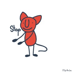
Ok so, the anatomy on the back legs ( Remember, this comes out of a person who cant anatomy in general ) are very nice in my opinion, i cant say perfect , since , i cant actually anatomy myself. So that is very nice. The front paw looks more like a fin than an actual paw, i reccomend adding paw pads so it looks more like a paw. Also, try make it into the shape of a paw. Only the hand was animated, i reccomend, since this meme is for a banging against the screen, you do all the frames individually. For this, i give it a 7/10
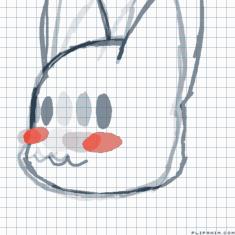
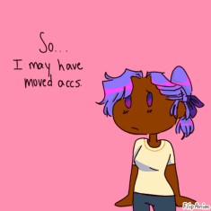
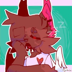
This is a very nice drawing, i wont lie, but there is some things off. I'm guessing this is a cat/fox thing that would supposedly have paw pads, so i recommend adding paw pads. Also there seems to be one ear. If she has one ear, im not judging, but if its your artstyle to have one ear on the side, i recommend adding an ear in the background so it looks like there's one behind it, and not just one.
Overall, i give this an 8/10
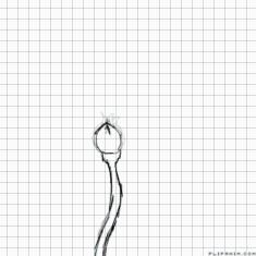
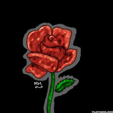
Ok well, this is super well done in my opinion. But since we're going from like anatomy, i dont know if u can even have anatomy for flower hhh- but for this, i'll do some shading tips. I know this is super old and you've improved but the shadings quite off. Some places it's super dark, some places its super light. Maybe try sticking to a darker color? So if its a dark shade of flower, i'd add darker shading. If it's a light shade, i'd also do darker shading. So next time, try not to add the lighter shading.
Overall, the drawing is a 7/10
But for the shading, i'd aalso give it a 7/10
Ok well, ima just take this from the top.
tHE DOG HAS NO ARMS
Idk if its a dog but it has no arms whatever it is. If its supposed to have no arms, well woopeedo half of this inmprovement this is going down hill. But if not, i'd recommend drawing the arms so we know it has arms, atleast. Also, the shoulders are a bit off. If we're going for anatomy here, maybe make them more straight. Because actual human arms don't look like camel humps. Anyways, overall i give it a
6/10
wOWE THIS IS FANTASTIC
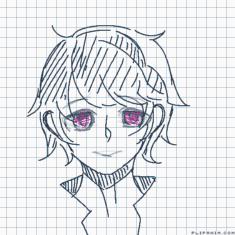
Just i have a few things to say. The hair is a little bit, well, short. Because if we're going for looks here, Tord would definitely have taller hair. I get it if you were just trying to hit the hair into the picture, but if we're trying to do this properly, i'd make the hair taller for Tord's actual look. Also, i get it if this is for angle practice, but the ears are kind of small. BUT of the ears are behind the hair, you can forget about that. Overall, its an 8/10
Ok well, lets start of with the bigger drawing in the corner, Looks pretty good to me. I just have one problem. the eyes, the eyes are ok but, the pupils. the pupils are poking out of the eye and are somehow on the head? Hopefully you get what i mean. Anyways, in the corner its pretty nice. I'd recommend making the tail a bit smaller? i get if its long but.. yeah.. Also the arms. t h e a r m s. they're very stick like and if we're talking anatomy, we're talking about the arms. Maybe draw them properly, so we can actually see what it looks like, so in the rp we don't think " this guy has stick legs and arms. ok "
Overall, its a 7/10
MmMmMM YEET
thats literally
hUUU
anyways
i t s
g o o d
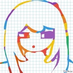
but like maybe work on the legs coz, if shes standing on her heels, her keels would be a bit flatter and not curved, if its curved it looks like they're somehow flying. Also the knees could be a little bit more obvious? Because i just did an example of a flat leg irl, and you'd see the knee. overall this a 8/10
IT GETS A LIKE FROM ME
Comment removed
