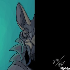
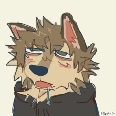
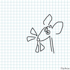
I'll critique your oc's!


23 comments

catcutiecats
15.06.2020 01:34
Link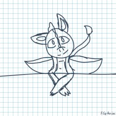
Qinter[OP]
15.06.2020 01:36
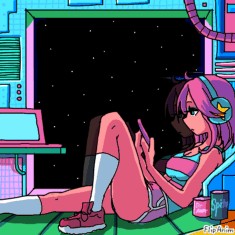
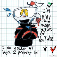
Link1. Right eye is actually left eye.
2. Nice color scheme.
3. Blue looks a bit startling and out of place, but nice at the same time.
4. Right (or left) eye is clique.

catcutiecats
15.06.2020 01:44
LinkDo I are have stupid lol I wrote right instead of left wtf
I mean it’s on th e right in our view but not on her view

Qinter[OP]
15.06.2020 01:55
Linkyeah, that's what I thought you meant lol
QuinterTurning
15.06.2020 22:11
Linkdid you mean cliche?

Qinter[OP]
15.06.2020 23:28
Linkyes i can't words

QuinterTurning
16.06.2020 00:24
Linkok then

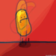
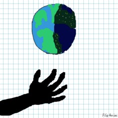
First one:
1. Not really sure what it is.
2. Colors clash, although not in a good way.
3. Looks creative, you should give it a ref if you haven't.
Second one:
1. Beast from hell.
2. I'd like to see him close his mouth with those fangs of his.
3. He's transparent, or just black with fire/blood patterns on him.

