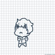
Like, color-wise and stuff..


10 comments

neutrois[OP]
18.11.2024 06:45
LinkIt's been looking too dull recently
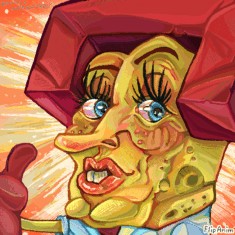
I really like utilizing different colors together such as a magenta red with purple as the shading
The colors are more close together and more vibrant that it really sticks out, but sometimes if you center your piece round 1 or 2 central colors, it can really make your piece stand out. For instance, green and orange- red and blue, yellow and green, yellow and blue, orange and purple, blue and orange, ect. ect. Whilst some of these color combos seem like they won't work together, it's strangely effective if you can utilize the colors in between them as a midshade, which will also make the 2 central colors pop more.
Another thing is choosing where your lightsource comes from. Having dramatic lighting can make all the different in your piece. And you can use several different colors to display what kind of environment you want your character to be in. I really like using green accent lighting for more crazy characters of mine. Some of my characters have 1 lighting color that they fit into based on their

personality or what color their clothes are.
Idk why I'm ranting I just find color so exciting.
I think you're drawings are very pretty and nice :3
But anyway...ghshguisdhf
choosing a color that you may find dull, and finding a variant that's close to it or makes your eye believe it's that color, and more vibrant can make all the difference. I really like shading with green and a rusty brown sometimes if I want my piece to represent something more dull, which can make the viewer recognize it as a different color if up against a darker background or a lighter background. But all in all- it's up to you how you want to portray your feelings or characters in your work. I for one really enjoy your art and find it very pleasing to look at. So express yourself the way you feel in your heart! Whatever color speaks to you, that bleeds out onto the page will show what you are feeling or want someone to feel and it your followers will notice! :) Goodluck!

I typically use highlighter colors that on a color wheel work well together and partner them using the outfit scheme where you go dark, light, dark, dark or the other way around like hat=dark shirt= light pants= dark shoes=dark but the other way around ig? I also typically will shade with a bright color that contrasts against other colors at times I'd just use a color wheel tho and take extremely bright highlighter colors and the one directly across and use those if your looking for a more bright less dull color pallete
