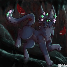
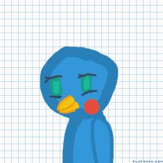
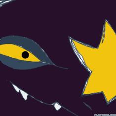
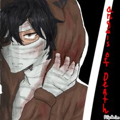
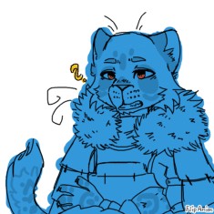
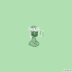
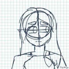
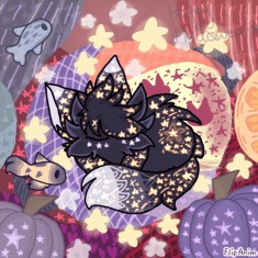
ill rate ur art ig


40 comments
ThisNameIssTaken
29.07.2020 12:01
LinkOk one sec


ThisNameIssTaken
29.07.2020 12:02
LinkV


ThisNameIssTaken
29.07.2020 12:02
Linke
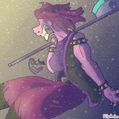
Yellowmocha[OP]
29.07.2020 13:10
LinkI like it! The poses are simple but effective, the colours pop out against the background, and I love the way the shading isn't fully blended! 10/10!

I love the character design! I just feel like it's a bit simple. Maybe mess around with shading a lot and look at a bunch of reference images to see what looks good! And I also think the anatomy could also be changed here and there (e.g. the arms. arms don't really bend outward like that and they also seem kinda short, but then again that might be a style choice).
Just remember this is MY opinion, and you can add or change anything you want about your art!
7/10
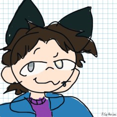
i have two that I did off-site because drawing on here is super hard lmao
A: https://cdn.discordapp.com/attachments/617169179145011205/739110995594838156/Untitled404.jpg
B:
https://cdn.discordapp.com/attachments/617169179145011205/739110996064468992/Inspiration.png

I like them both!
Although, one of my pet peeves with a lot of art is the fact some people use the airbrush tool to shade. Personally, I think that if the person who drew the art is not at a high artistic level (sorry if that offends you D: ) then it will looks bad. I always do cel shading (kind of sharp shading where you can see where the shading meets with the colouring). To me it just looks better, but that's just my opinion.
Another thing is the hair looks kinda of scruffy or rough. I don't know if this is intentional, but I always draw a bunch of... uhh... ima have to show you

The shading in the first one is also pretty simple. Don't be afraid to try out new shading styles!
Uhh uhh there are more small things that could be improved on such as:
- the anatomy
- the backgrounds
- the creases in clothing
- the blurred stuff in the first drawing
And I would say keep practicing and you'll get better at all these things! Getting some education on how to draw so that the objects/characters look 3d might also help as well.
7/10

