- create flipbook animations online!
Login
Dont ask
GIF
Report
19.03.2021
8 comments
19.03.2021 18:45
Link
Report
Is this comment inappropriate? Report it?
Yes
No
Thank you!
I'm asking.
Comment removed
19.03.2021 18:50
Link
Report
Is this comment inappropriate? Report it?
Yes
No
Thank you!
Thats illegal-
19.03.2021 18:50
Link
Report
Is this comment inappropriate? Report it?
Yes
No
Thank you!
>:D
19.03.2021 18:51
Link
Report
Is this comment inappropriate? Report it?
Yes
No
Thank you!
Reply to a comment
21.03.2021 01:08
Link
Report
Is this comment inappropriate? Report it?
Yes
No
Thank you!
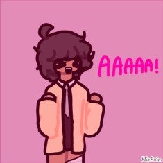
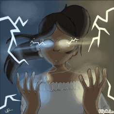
hmmmm why is the shadow a blob? I get it, it's stylized, but I think your art would benefit from a more clear direction/angle of the light source
21.03.2021 01:09
Link
Report
Is this comment inappropriate? Report it?
Yes
No
Thank you!
Don't get me wrong, I like the shades. I only think the parts on which they are applied on should be a little bit different. For example, I like the shadow on the forhead. It also kind of implies a general lightsource from above. We should follow this idea through and put the shadows on the character accordingly.
21.03.2021 01:10
Link
Report
Is this comment inappropriate? Report it?
Yes
No
Thank you!
The shadow on the neck is also correct in that case. I think it needs a bit correction on the torso and legs though
21.03.2021 01:12
Link
Report
Is this comment inappropriate? Report it?
Yes
No
Thank you!
I don't know how you drew this, because drawing on a phone or with fingers/trackpad for examples are way harder than with mouse or pen. But if it's possible for you to work more precise, I would suggest you take another look on the legs, which appear a bit uneven in thicknes :)
Login or register to post new comments.