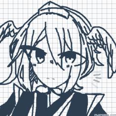
tian gou(not yin yang shi!

Every flipanim animation ever
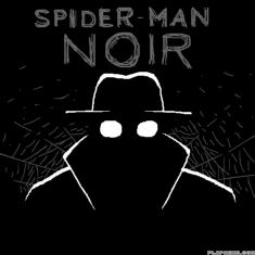
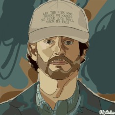
Spider-Man Noir: Part 1
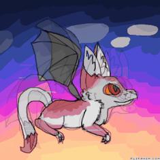
Pablo flying

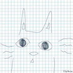
cat
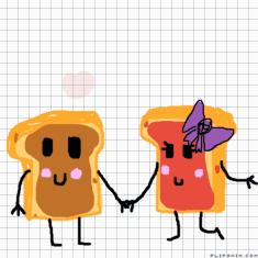
This is where SW come from kid

2 year special
what do you think?


10 comments
ultraliqht[OP]
18.05.2021 19:12
Linkbe honest pls
If you're looking for constructive criticism, i can offer some! :D
I personally think the design, colors, and simplicity of your style work well together! It might just be in your style, but there's a few things i can point out that could be better/fixed. (not that any of it looks wrong, just if i were really looking for something to talk about!) The back right leg is missing. However, this is kinda up to debate whether it SHOULD be there. If the left leg is sticking out with the paw visible like i think it is, then the right leg isn't really needed BUT the paw/bottom of the leg could be bigger to signify that it's closer than if it were in a normal position. the other thing i noticed was how the left side of the head's features were larger and more visible than the right side despite being a profile or the right side of the face. i'm pretty sure this is just part of your style (as observation from previous artworks), but tECHNICALLY the ears, heart, and face floof on the left side should be smaller and-
