I bin done reanimated it
🌈 ;3

Sans
Smile :)
222
HAPPY B-DAY! @XxThe-CoconutxX
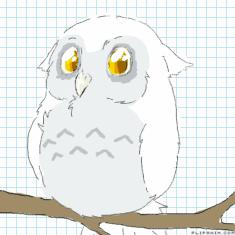
little snow horned owl
I'll rate your OC

by:
Cattycakes  183
183
 183
183
09.06.2020

22 comments
Cattycakes[OP]
09.06.2020 16:06
Link-
Cattycakes[OP]
09.06.2020 16:08
LinkI'll rate your OC with my opinions. If I feel up to it, I'll say what flavor I think they are too, just for fun
I might be mean!

Cattycakes[OP]
09.06.2020 16:09
Linkalso, inspired by
Lylac:
Pretty cool! I love the color palette! the blush being yellow while the blood is red... Kinda strange, too, considering how blush is just a blood rush (BLood rUSH), but overall, pretty good! 7/10
Lylac tastes like oranges
Mocha:
I love their design! But, the markings are kinda all over the place. It must be a pain to try to draw from memory. I love the color palette, though, with the browns and purples. Again, simple complaints about same-color stuff, but other than that, pretty good! 8/10.
Mocha tastes like half-and-half creamer
;( (redesign)
Pretty cool, a nice and simple design. I like the combination of cream and white, and the blue is a nice touch. Not too simple, not too complex, and with the right amount of detail. 8.5/10

The design is fairly good, but the colors clash. Maybe make the blue more of a purple, or the reds and oranges more grey? Plus, all the spots on the wings must be hard to draw, but it looks really cool! Also, I love the tail. Overall, not bad, just a little eehh. 6.8/10

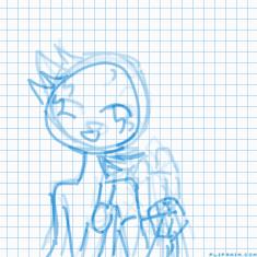
Pretty simple design, nice colors. Could use a little bit of color on the back half, but still pretty good! Simple design, maybe too simple, but still cool. 8.5/10
They taste like the smores jellybeans, if you've ever had them

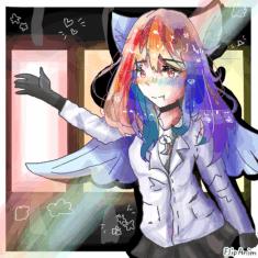
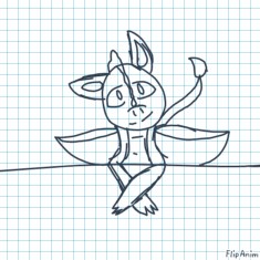
Pretty cool design, but I can't tell what's going on with the hair- it might just be this specific drawing though. The shirt and jacket are pretty basic, which isn't a bad thing, and the pants are just plain black. Very simple clothes, but again, not a bad thing- I also can't tell if they have a tail or WHAT that thing is, but again, might just be this specific drawing. Overall, kinda eh. 6.2/10
They taste like thin mints


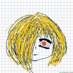
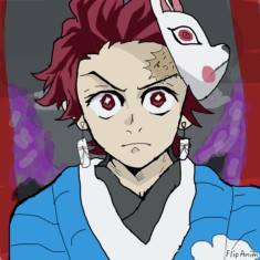
The colors don't go well together- the mint and the orange clash, and I have NO idea what's going on with the face. The shapes used to make them are very basic. I do like how you stuck with mainly two colors, but they just don't go well together- It looks like orange juice and toothpaste. 4.9/10
They taste like blueberry poptarts