- create flipbook animations online!
Login
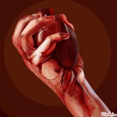
But do you love me back? ~
by. YxCaro
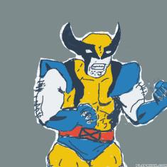
Wolverine
by. Anonymous
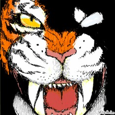
TiGeR FaCe
by. panda-girl
Untitled
by. Anonymous
皮神×
by. Anonymous
If I was SpiderBoy
by. vegeto123
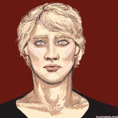
Antagonist 1
by. Neechole
Report animation reason:
Not marked as 18+
Other
Report
Cancel
Thank you for reporting any inappropriate animations!
Thank you! :)
Close
Your report will be soon checked.
Animation options:
Cancel
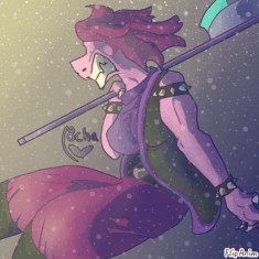
i'll critique ur art ! ^_^
10
Like
GIF
Report
by:
Yellowmocha
1151
17.12.2021
FlipAnim uses Google Analytics for page statistics which uses cookies. Learn more about new
Privacy Policy
Accept