game fail
Reaper Problems
Untitled

luciaaa

Alan Shepard's Flight (Offical
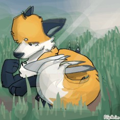
Tundra and Spwider
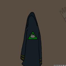
Part for an MAP
anyone want some drawing tips?


15 comments
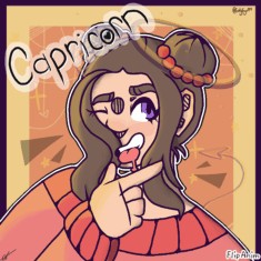
capricorn[OP]
20.02.2021 18:52
LinkComment removed

capricorn[OP]
20.02.2021 18:59
LinkSo, i had nothing to post so i decided to do drawing tips who need them and for the people who SOME REASON like my art style.
yea im just gonna get into it.
1. always make a base.
when drawing, you need a base by using any color (must be a light color) so that you kinda have an idea on how you want to body structure to turn out.
for the all the joints, make little circles in plane and for the head, make it bigger.
2. make the head last
recently ive learn and realised that we tend to want to make the head way bigger than intended. my suggestion is to make the head last when doing the base so the head wont be as big.
3.zoom in.
when doing lineart, always make sure you go on another layer and zoom in when doing it. zooming in will make the lines much cleaner and smoother. on this site, for some reason when i do lineaart without zooming in, it all wiggly and not equal at all so i recommend zooming in.
(still typing)

capricorn[OP]
20.02.2021 19:06
Link4.use another layer.
obiously we want to use the bucket tool but we cant because there are always spaces between your lineart so make another layer under the lineart. another reason why we should use another layer to color, is that, when we shade, the shading part overlaps the lineart which makes it seem messy.
5. shade for more value
ive learned that when you shade, it adds more value to your drawings and makes it more realistic.
i know its hard to shade but we cant just shade random parts that dont need it. we need to shade reasonably.
for example, sometimes we draw hair, the hair comes over our clothes. we need to shade there because the hair is on top of the clothing.
6. either use dark blue with low opacity to shade, or a darker shade of the color you are shading.
if we shade with black, obviously it's way to dark and just makes it look like it is a weird design on the place you are shading.
I hope you learned something new and applied these to some of your art work! :)
Peace, out. ✌
