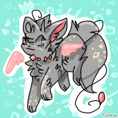
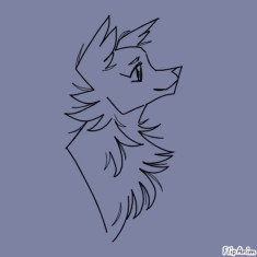
Rate my anatomy
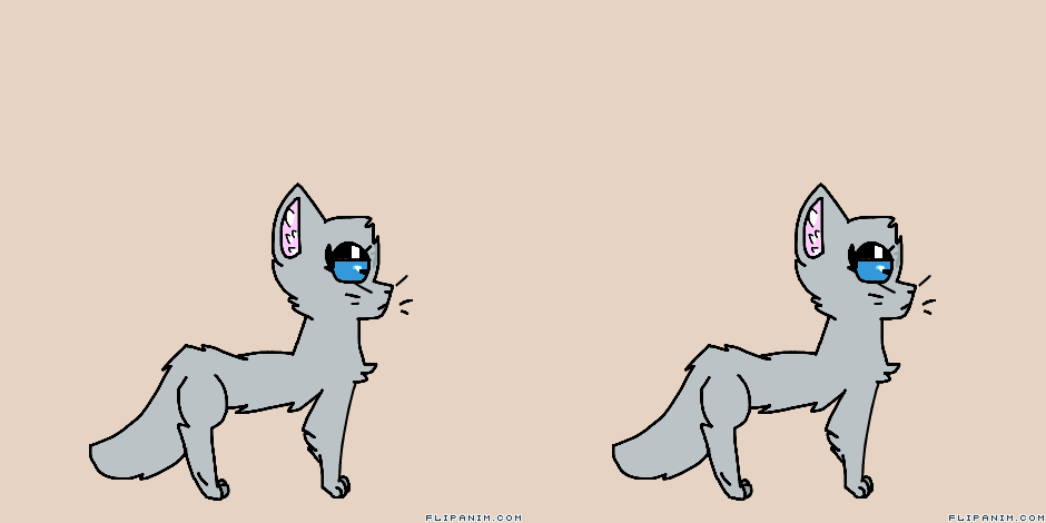

18 comments
Toastfly[OP]
07.11.2018 22:42
LinkGive me honest critiscism please ~
i need to sleep rlly soon, so be quick!
Toastfly[OP]
07.11.2018 22:45
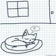
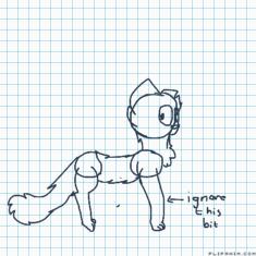
Linkthe front leg isn't normal, i realized that.
Toastfly[OP]
07.11.2018 22:50
Linkwhat about this???
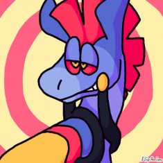
mmmm HONEST
5/10 realistically wise.
7-8/10 cartoon wise.
Realistically, the thigh is practically a circle, it needs to be stretched out. the neck and tail don't blend into the body and the choppyness with the tail is covered by fur. It's too skinny, and the paws are too small. The face is fine apart from the eyes, which are exaggerated.
Cartoon wise, the only thing is the neck and the tail, idk why. But most of these realistic wrongs can be turned into style choices. This looks good overall cartoon wise.
I think it's ok
the back legs just could have been a bit like y know
like this -
https://goo.gl/images/rgsAi8
https://goo.gl/images/XHX9Tz
and the front could be also like this -
https://goo.gl/images/B2ybzL
Im not good at explaining, so this is all I can do really
but overall, its pretty much alright
6/10
besides, the stomach should be bigger, i would also recommend showing the other legs too, with shading. the tail should be longer a bit, i also highly recommend shading. it makes the whole art more realistic and unique. and i would also recommend using paint roller to fix the fur. besides, this whole anim looks like a cartoon drawing ouo. and the last thing. The shoulders should be a bit bigger. and p.s the eyes should be smaller. Cats and animals dont have it that big. I recommend studying anatomy with refs first :D
i hope this was helpful :D
