Don't Break It
Unimpressed Drow

Untitled
cc
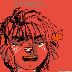
A small oc emotions thing
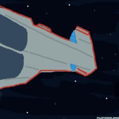
Daniel Jin Starbounds wrong

Protagonist
Who do you want to see more?

13 comments
SozrayaTheQween[OP]
15.02.2020 11:10
Link1- Skylar and Bella
2- Naomhi and Heather
3- Smokey and PrimRose
Hello there UuU Let's begin with the review, now shall we?
Please give me feedback about what you think about this review.
Just in case, feel free to help with grammar mistakes as I am German. That may be the reason why anything I'm going to be saying sounds direct, so please forgive me in advance. :3
Artstyle
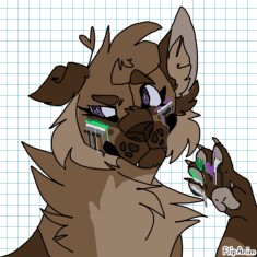
I looked at your recent and older posts and your artstyle became more consistent over the last 6 months. You go for a more cartoony style, using outlines most of the time. There is definitely a heavier stylization present.
Outlines
I indeed think that your outlines are pretty impressive considering you use a trackpad. Although there are still some tiny spots that you could tidy up a bit, like overlapping, but that's really nothing disastrous. I'd rather ensure that no color overlaps any outline.
Even though Apple trackpads are somewhat better than most, a trackpad can be considered as a handicap. This goes rather for the quality of outlines and how clean your art looks. In my opinion it does not affect how good your art is ultimately, because there are many factors involved. And much more important than a tool is how we use our eyes to judge whether a drawing is good enough. Nevertheless I personally would suggest to you that you get yourself a little drawing pad at some point (used ones can be pretty inexpensive). Yes, it takes time to get used to it, but it's worth it, I think your outlines would get even better. I feel like it may limit your potential a little bit. :3
Shading
This is definitely worth mentioning. You're being very cautios/reluctant when it comes to shading. You don't really seem to dare putting proud shades on your pieces. This gives your pieces a rather striking impression, but I also feel like you're maybe not really into this.
https://flipanim.com/anim=hlCXc2H8
This piece of yours may be heavily referenced (again, there is nothing wrong with that, quite the contrary is the case). Good thing here is, you knew where the light is coming from, so this clearly is "better shading". But also I have to point out that you weren't sure how to exactly put the shadow on the character. Because as we know, shadow and light follows form, so where to put it? This in my opinion is the very thing you should be practicing. Or in other words, if you practiced this, your art would benefit fast and vastly.
Perspective
I have a similar feeling about perspective. Many of your pieces show your characters from the side or the front. Zero or 90 Degrees angle. This is nothing you shouldn't be doing, it looks good and it's good practice. But just try and draw some 45 degree angles, you know, just because you can. It's not as easy because you have to think of certain forms and shapes, but your artstyle will benefit from this really fast.
Example: Conner
https://flipanim.com/anim=5HN5jMRE
There you have 30 degree view of this character. Also, some correct shades are there. But don't use this as practice reference, this leads to the next point
References/Practice
A question I cannot answer for you: Where do you want to go from here? Your art is cute, and I think the forms you draw are good but where can you go? I prescribe several heavily reference drawing for you! Look up some realistic animals (even skulls) and try to understand the underlying forms: How long is a snoot, what is it's fOrM? What form is the forehead of a wolf or a cat? Again: You're not doing it wrong from the front or the side, but it will help you massively when it comes to drawing from advanced angles and shaping.
It might be about time to ask yourself where you want to go with your art. I've seen your old and new posts, some differ quite a lot.
Your newer posts are getting more and more consistent in artstyle, which is good. This shows there are certain techniques you don't really dare to use/try. And exactly these are the next steps you should be doing to progress
Comment removed
