Flipanim the Generous
Untitled
Untitled
He can't use chopsticks
Welcome to FlipAnim :3
Red Machine
LEGO Walk Outline
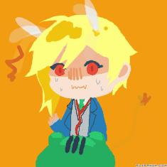
in a helpful mood rn
98 comments
THEYCALLMEPAIN[OP]
22.02.2022 00:34
Link-
THEYCALLMEPAIN[OP]
22.02.2022 00:34
Linkgonna try and be as clear and helpful as possible for this
THEYCALLMEPAIN[OP]
22.02.2022 00:36
Linkayo please attach an anim for me to look at
THEYCALLMEPAIN[OP]
22.02.2022 01:34
Linkk after finishing the last 5 (or maybe a few more) i'll continue the rest tomorrow at school during my break time
background draws viewers to the character, which is a very good art trait and colour choice is decent
the thing holding all that back is 1; the shading and 2; the lineart
to get better shading; avoid using colours like black/default navy blue and avoid using white for highlighting
instead use colours like lilac/pastel yellow for lighting and mix up the colours for shading
for example: if i have a medium/light red as my base colour, instead of using generic black/default navy or even dark red, i could use medium purple/magenta to make the red pop more
happy drawing !!
you have a clear light source and direction, which is a thing that even i still struggle w/ from time to time
drawbacks would be the lack of variety with the colours. default colours can sometimes be good, but with the kind of sunny drawing you're drawing, it's not too great of a fit
another slight drawback would be the lineart's lack of variety in terms of thickness. it reduces the quality of the piece
instead of going straight onto lineart, make a quick sketch on a seperate layer w/ a gray or light colour. once done, go over it on a seperate layer w/ lineart colour of choice. once done, delete sketch layer and you could do two things...
one would be thicken areas where lines overlap
two would be thin out lines where there is no overlapping present (use an eraser tool in a size smaller than lineart size)
happy drawing !!
okay so ur flat colour choice is very appealing to the eye, but the thing killing that is lack of anatomy, thickness in lineart, shading and highlight
ofc shade and highlight isn't entirely necessary, but in ur case it would be quite useful
to help with anatomy, use people as a reference. using a site like justsketch.me could really help with both anatomy and light source. hard to navigate at first but it gets easier the more u use it.
it could rapidly boost your improving rate
happy drawing !!
ok using the attached drawing as ref
everything about it is lovely, from lineart to facial expression
still there's room for improvement ππ
the hair seems to be less bold compared to the rest of the person, which is nice, but it lacks depth
tip: areas where theres shading involved tend to look better when the lineart is bolder/thiicker in those areas
even when colour isn't present, adding at least extra thickness to overlapping lines bring out a piece
happy drawing !!
i see that you have a very good grip on anatomy and that's great
the only issues would be 1; the fingers are unclear and 2; the left arm looks funny in shape
tip for hands: to make a hand, break it down to the palm being a rectangular looking trapezoid, map out fingers w/ lines and circles for joints. after mapping is done, thicken it w/ rounded cylinder type shapes for soft fingers or rougher pillar-type shape for a rougher look
happy drawing !!
okay your lineart isnt resticted to one colour, which can make or break a piece. in your case, it really helped. you also have a clear light source, which is a huge success
your main issue would be the lack of variety in shading colours
a great tip for you would be to expirement with absolutely unrelated hues as shading instead of using the same colour for each part
for example: instead of using gray for shading white, using a dull pink or magenta would make your art pop more
happy drawing !!
YOU'RE NEXT !!!!
okay so everything abt ur art i love, from colour choice to overall ending product
only thing i can tell you is that the light source isn't too clear in the ibuki drawing, which would be fine in general, but there are candles in front, which radiate light
thing to help your art is light coral in 0.02 opacity on cheeks to give a more youthful and blushy look. helps make the viewer enjoy seeing your work more
also using lilac on 0.03 opacity a little on shaded areas can make those areas have a more realistically shaded look
happy drawing !!
k so flat colours r great and all but there is a severe lack of anatomy (in terms of hands/bottom portion of body) and a lack of proper highlight on the dark brown areas
k to get less obviously opacity-based highlights, go with less opacity like 0.02 to 0.04 and choose less unappealing colours (like the white used on the leg) to add. a great example for a nice highlight colour would be a coral pink
okay so your piece is beautiful honestly, the flat colour choice literally works so well w/ ur piece
downside to the piece is the lack of texture being shown on the fur for example
alrighty we can fix that π
to indicate furry texture, outline the outskirts of the ur area using circular shapes (like a cloud) and do that w/ colours that do not correspond w/ the flat colour (exp. don't shade red with red, don't shade yellow with yellow)
happy drawing !!
okay your colour scheme is decent, but the anatomy and shading is breaking your piece significantly
unfortunately i'm not an expert w/ furry anatomy but i can help w/ your shading issue
never try shading a piece with black and try to refrain from using white as main highlight.
this is because it makes the piece look muddier than it should be and kills even the best colour combos
using pinks and yellows as highlighting colours as an alternative and using magentas/purples for shading can boost your shading skill (use 0.02 - 0.04 opacity for cleaner look)
happy drawing!!
okay your piece literally has every single component i'm looking out for, which is great bc it makes your art appealing to the viewer
only tip i can give that i think you've never heard of is an outfit colour scheme tip called the 3 colour rule
i don't use it too often, but when i do, it helps
ok so w/ outfit colours having too many or too little variety in terms of base hue can kill even the hottest outfit
to fix that, the 3 colour rule is a rule that even fashionable people use to make their outfits stand out
pick 3 colours (if u cant, use a colour generator like coolors and generate until u find yummy colour) this will be your colour scheme 4 the outfit
now you make one of the colours your accent colour. what that does is draw your viewers to a specific clothing garment
happy drawing yayyayy πππ
alrightie so the outfits themselves are really nice and they capture the seasons well, but there is a lack of variety in shading, not to mention the eye spacing looks off
we can help that ππ
k so to fix eye spacing here's a tip i use as often as possible: if the eye spacing looks wonky (maybe too big/small) imagine that you have to place a third eye in the middle. you should be able to fit a third eye (or at least nearly) fit a third eye in the middle. if the gap is too small and overlaps the 3rd eye then u gotta move the eyes apart. if the gap is too big then bring them closer together
happy drawing !!
Comment removed
giyuu moment β€οΈ
anywayss the drawing itself is neat and all but there's a severe empty feeling in terms of background and skin shading
all good though π
fixing the background issue: there is a great amount of white space that confuses the viewer, not to mention that the green is slightly unappealing. to fix this, use more distinct types of green for the base colour of the bush (exp. yellow-ish green, teal, etc.) and for the white parts, instead of having them as white, an alternative would be to use the bush colour but in a lighter form to make giyuu pop out and to fill the emptiness
2 birds one stone
happy drawing !!
okay for an old drawing this is pretty well-done, apart from the extreme use of plain white, which kills the drawings mood/atmosphere
tip: to have a smoky look without using white, use a dull pink/magenta on low opacity in circular motions (kinda like a cloud shape) and to make it stand out, use purple and violet dull tones at the bottom parts of ur clouds
happy drawing !!
okay first off THE BACKGROUND IS SO WELL MADE HOLY HELL. it captures the outside details without completely outshining the character, which is very difficult to achieve, so well done on that !!
the main drawback would be in terms of the lack of shading technique. i get that it's still present in the drawing, but its hard to see, and not very appealing once spotted
i gotchu though ππ
to fix that issue, use colours with a little more saturation and with a separate hue. this can help shading carry your piece better (exp. wit the brown sweater: instead of using dull yellow-tan, a magenta or even an orange-red with a dull-ish tone can make the shading more appealing to the eye)
happy drawing !!
everything about this piece, it's almost impossible to tell the lacking point, which is a good thing so congrats man π₯³π₯³
only thing i could really point out is that the background is great, but if you keep on repeating the same bg, eventually viewers get tired of seeing the same grid
to fix that, even adding something as simple as a pastel circle/square in the middle can kill the eventual boredom
happy drawing !!
k so the cat is very well drawn and extremely detailed in terms of every component for the keypoints so great job on that !!
only issue is that the background isn't as appealing, which is sometimes good to get people to look at the main focus, but it can also kill a piece if a viewer focuses on the bg for too long
to fix that issue, a simple thing to do would be to use less opacity and maybe aim for a more pastel minty-blue instead of a lighter version of the same base blue
in terms of opacity for backgrounds, 0.01-0.03 would be a good opacity range to mask the strokes w/ the opacity
happy drawing !!