
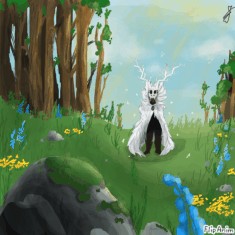
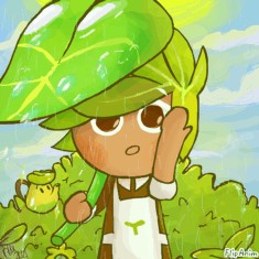

Pastel-thethic :3
by:
LilPandaAddict  200
200
 200
200
11.03.2020

29 comments

fireminx13
11.03.2020 01:35
LinkBro this is beuatiful
LilPandaAddict[OP]
11.03.2020 01:36
LinkAw thx :D
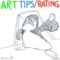
Pastel + aesthetic :3
Also yesh I genderbent ma persona because I was too lazy to animatic longer hair :>
Comment removed

Yay glad you think so :D
I was hoping it was aesthetic-y enough :>
Comment removed
Okay, so this is a rather short review for you
I guess that you also want to improve, so, I'm not only going to be talking about what's good in this piece.
Artstyle
I think your artstyle can be easily distinguished on this platform. It's generally a good thing, although there are a couple of things that I think you should improve. I think it goes more in the direction of anime/manga-ish artstyles, which is generally a good thing, but let's elaborate this in the anatomy section.
Colors
The colors fit well together. I think to some degree you have a complementary contrast going on in this piece, which intensifies the effect of both sides. So even it's rather pastel-ish and the saturation is rather low you still managed to make the colors shine using a complementary contrast. I think it underlines the intended impression of this piece.
Shading/Lighting
We have shadows under the sleeves on the back of the character, on the left side of the sleeves and the neck. Can't complain about that. The shadows on the legs and the knit cap are good as well. Imo there is some shadows missing, on the left side of the hair and the arms and on the Panda ears. The shadow on the right arm would be on the middle of the surface and there would be some highlights at the outlines
In general I would add more shadow to the character and less light, the light would be positioned more towards the outlines facing the sun. The shadows would be thicker, overall bigger. Same goes for the face (but tbh that's not easy). The character casts a shadow on the ground, that one is definitely missing.
I think the lighting on the leg (where the knee is pointing to the sun) goes way too much to the middle of the leg. It should be rather placed towards the outlines, because the sun is mainly shining on the side of the leg that cannot be seen by the viewer. Try it :)
Anatomy
You have practiced faces more than overall bodies, I'm guessing. So, when we look at the profile of the face. I have seen many profiles like that in Anime/Manga. It's not inherently a problem since the drawers of said comics are well aware of proper human anatomy and that's why this looks good. But also we have to understand what's happening here in this particular way of drawing things. The tip of the nose is really really high, which makes it seem more cute and tiny. This is not what I consider wrong anatomy because the "really important" things for correct anatomy are still correct. Important things like "Nose bridge at the height of the eyes", "nose bottom on skull base height", "mouth above the middle between chin and nose bottom". So, we cannot just draw a face in any way we want and it will never look ridiculous (your drawing is good, this is not about yours right now), that brings me to the following excursion:
I really think you do these things correctly, but also maybe unintentionally/by instinct. I cannot stress this enough to everyone: Draw faces and change things and judge how the faces look "now that I have changed XYZ". For example, just draw the nose bridge above or underneath the eyeline. Shorten the depth or height of the skull. At some point it will look ridiculous. This paragraph is not a criticism of your work. So, if you go and add some knowledge to your instincts (which are correct already), you will increase your skill a lot in no time.
So far we have looked at what you have done well, but we also talked about WHY it's good and that we have to understand why something we draw looks good.
Also, really important: They eyes are exactly on 50% of the overall height of a human skull. In Anime/Manga, this line is often times underneath that line. So, your eyeline is a little too high. That also implies that the whole construct of nose and mouth has to proportionally scaled downwards a little bit along with the eyes.
The ears begine about at the middle of the skull depth so that's okay, but at the same time there's something off about the jawbone, where it meets the ear. This one's important, look at the mirror and try to see the difference. The jaw overlaps the ear a bit, that is what I consider definitley an anatomy mistake.
I want to talk a little less about the rest of the body
But you really should work on this also: The upper body seems to lack a thorax or at least the deepness of it. It looks a little bit too thin , imo.
And the main - the biggest mistake in my opinion is the connection between hip and legs. It's almost unclear to me where the hip ends and where the legs begin. It lacks the connection of hip-butt-leg. At first glance it's not a problem, but when you look at it, you can clearly see it.
You can fix this by drawing a short pose sketch beforehand (e.g. https://www.deviantart.com/diana-huang/art/Draw-More-People-in-Action-510867247). It has to bee all connected as one thing.
The good news is, you can fix it easily because you have the skill to do it. You have the eye. You just need to focus on it. You can master in in no time, no doubt about that. Just draw with more focus on human anatomy, you will see a big difference even over a few weeks.
Comment removed
Outlines/detail
I think the outlines work well together with your artstyle and even though you varied outline strength and detail, all of it looks consistent.
Animation
I like the hair animation, looks really good, well done. ^_^
And the butterflies are adorable as well. I think the animation of the bit of hair and the nose-outline somewhat overlap in one frame. I think you could tidy it up easily and it would make it look more cleaner.
I cannot approve of the animation of the hoodie ribbon. It comes out of the wrong place and it also defies gravity completely. It should be facing downwards and moving gently with the wind. :)
footnote
the shadow that your character casts on the ground is there - yes, but it is not long enough. It would be way longer, at least a few meters.
If there's something missing in this review please let me know
Also, feel free to review my review :)
Tysm! :)
Omgod that’s a lot (even though you said it would be short, but it’s ok) ,,,XD
Hopefully that didn’t take too much time (although it looks like it did XP)
My review of your review:
-You’re right about me missing some shadows, I just wish that I knew how to make them look smoother (and blended) or if that would even be necessary and it looks ok already...
-About the eyes being a little high, now that I do look
back at it they do seem pretty high ... 👀
I could move them more down if that would look better, but that is how I usually draw em in my style, which isn’t completely anime based (but I see why you’d think it were that), I guess I’d call it more cartoon-ime [cartoon+anime] since my front facing noses aren’t really anime but the eyes are mostly anime inspired (in fact I was trying to move away from a completely anime style and wondering if I should idk add nostrils...?)
-For the anatomy part, your right about him looking a lil skinny, and I’ll try to fix that if I do another full body
My review of your review continued (because I didn’t know there was a typing limit lol):
-For the anatomy part continued, about the hip-bum-leg thing, I wanted to make his sweatshirt look a little oversized which is why it goes over the bottom, but srry for not makin that clear in the pic
-About the animation part, I thought that if a strong wind blew hair pretty high then a sweatshirts drawstrings would go just as high (from the point on where they started of course) but I’ve never seen drawstrings being blown that high irl so what do I know XD
That’s all :)
(If there was any part of your review I didn’t mention it’s because I agree with that part and get what you’re saying)
Comment removed
Okay they are called drawstrings. Yes wind can blow them as high as shown but it has to be really strong.. and the hair is lighter than the drawstrings. So, you can show the "weight" of things by moving some elements more or less in the wind..
Thank you for your reply. This review is completely focused on showing you where you can improve. I know very well that most of the peeps don't want something like this, but this is what I consider to be real help!
Take care :)
Ty you 2 :)
It was good constructive criticism :3
(And yea they’re drawstrings not ribbons, but they do look like ribbons lol)
