


TIP: Complimentary colors.
by:
ArsonisticArtist  409
409
 409
409
17.09.2021

4 comments
ArsonisticArtist[OP]
17.09.2021 20:13
Linki suggest pausing the frames to read them.
ArsonisticArtist[OP]
17.09.2021 20:17
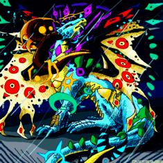
Linkif you cant read them(this was rushed so ^^"")
Frame one:
The colors im about to show you are colors called complimentary colors. which means, when they are put together, they contrast each other(make each other brighter)
Frame two:
depending on which there is more color of, depicts which color pops the most. i made a solid circle of green, with a smaller circle of red inside, the red pops out because of this.
there is more green than there is red.
Frame three:
knowing these things can help young artists learn how to make flat colored backgrounds with shapes, like borders and colored lines down the center.
ArsonisticArtist[OP]
17.09.2021 20:19
Linkanyways i gotta go, i have work in two hours bye
