I’ll rate your ocs

61 comments
FoggySkies[OP]
12.04.2020 15:54
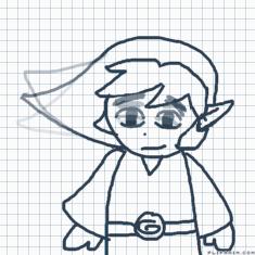
LinkCredit Lonley Paradise for idea

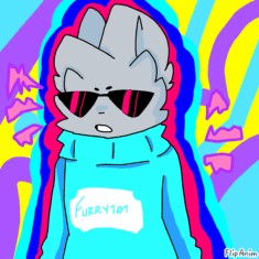
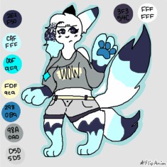
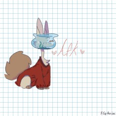
The main aspect that really makes it stand out is the head, I can instantly recognize it with how distinct it is. He the brown pancho thingy goes well with his color scheme. Though it could use a couple of extra details, his design is simple. Not that there is anything wrong with simple in that regard.
7.6/10 Nice

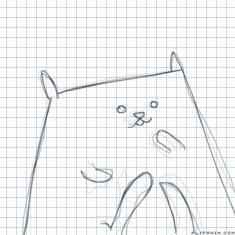
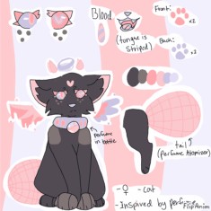
Your art is actually really good, your very underrated. The first one has a nice belly pattern and the grey goes well with it. As for the second one, it looks like it has a lot of potential, and could be a really fun character. Just add more details to make the designs more interesting.
6.6/10 for both
Comment removed

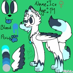
Hmm, I don’t think crystals was what I was going for. It was something more to match my username, and I wasn’t going for lots of fluff. The color scheme also wasn’t supposed to be very bright, as the bright blue pendant was just meant to add a little pop of color, and the pendant is what gives Ice her powers. Without it, she can’t fly. I understand what you’re saying, though.

The theme of Ice was to have a soft color palette, with some darks in there to represent the two sides of her personality. The bright pendant represents Ice’s power, and how she feels that she’s nothing without it. Whenever she takes off her pendant, her color flushes out and she’s reduced to a grayscale.
However, I understand what you’re saying and what you’re going for.

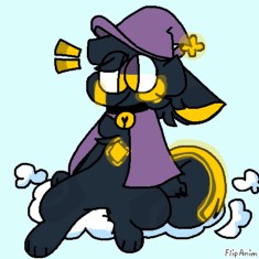
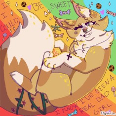
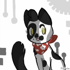
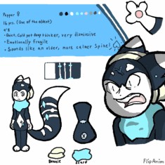
The concept is really cute and the bandana ties everything together. I can’t find much to critique, other than the fact that the tail seems a bit plain. Perhaps add some splashes of white in there? The patterns of black on the face by the nose seem a bit overwhelming, rather I’d have one spot around the eye and one around the nose, rather than one by the mouth as well. The ears are a bit plain as well; I think you should add maybe some white to there. Overall it’s a very solid oc, I just think you could redesign some patterns.
8/10


