constructive criticism?

12 comments
CuteCoofee[OP]
29.11.2017 15:03
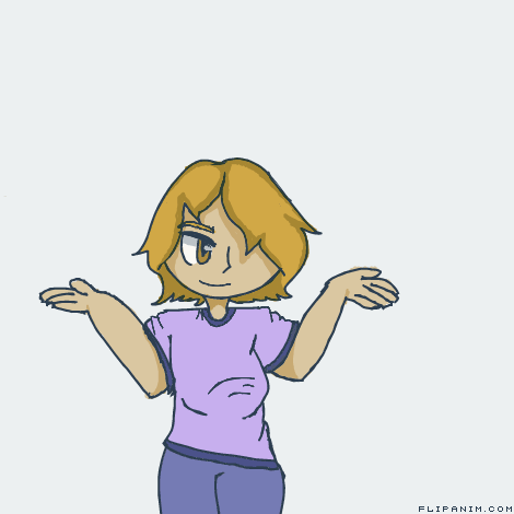
Linkconstructive criticism on this please?
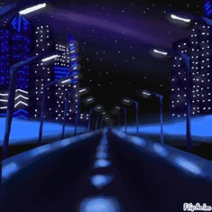
The chest is a little to long for the body size and isnt supposed to go into the stomach like it does, the way that it is makes it look like there isnt a rib cage. The thighs are two different sizes and the hands look a little to.. 2d try making some of the fingers not as visible and behind other fingers so it looks like the hands are sideways. i dont really know how to explain it that well.. Also last thing. make it look like the sleeves arent like painted on by adding weight make them hang down a little bit, dont make a line going up above the arm though because that defies gravity.
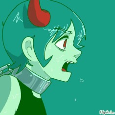
The arms are a little too long, her hand is smaller than the wrist, the boobs, one leg is thicker than the other, the arms are really thick just below the shoulder, where is the other eye? Finally, there is no shading on the clothes even though everything else is shaded nicely.
The eye is pretty low too
I think the fringe would not completely cover the other eye, the breasts are lower than normal, it seems that an arm is more behind the armpit, neck is a little too thin, as the color and shading very cute, You do a good job when drawing, keep it up! Like I am nobody to say this, I draw very badly, I only fulfill what you asked for in the title xD
