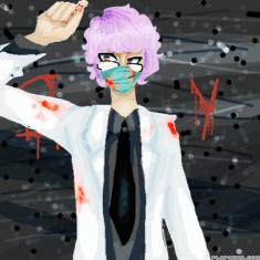
"The doctor will see you now."
Untitled
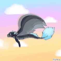
~A Lazy Sunset Flight~
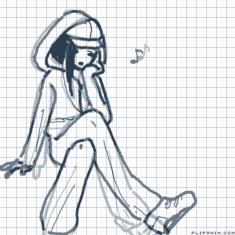
Untitled
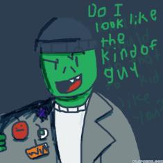
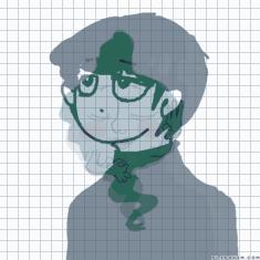
You look like a snake!
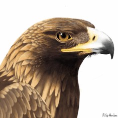
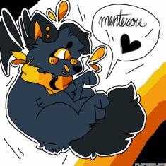
Golden Eagle

Sideshow Bob
Attach an art


14 comments
pablofawkes[OP]
07.07.2018 00:27
LinkI'll honestly critique your art. All responses are my opinion, but I'm always right, soooo....
Ok, the highliting is pretty good, I'd say to try to make it a bit less wobbly and skwtchy, but overall is fine.
The hair looks like oily spaghetti. I'd advise you to colour it all on colour, rather than trying to make separate strands, then highlight it like everything else.
The back goes too far in at the middle, it looks broken . And the chest looks blocky and square at the front.
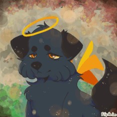
The crown looks flat, like it's two pieces of paper glued together onto a headband.
Mostly, you use the highlighter too much. Maybe try one where you use the pencil with a lighter colour, rather than the highlighter.
That tool is garbage.
Overall, this is pretty dang good.
The background looks a little cluttered. Maybe lose those lines putside the borderyou made, and the black pattern on the top right corner.
Also, the using all three shades of brown in each brown spot looks alright, but in other works it could look a bit bland or cluttered.
Also, I personally don't like shading on eyes, but even if I didn't the one in this pic is a tad dark.
Compared the the rest of the anatomy (head , neck, chest and limb length) the arms look a bit thick.
Also, the thighs look a tiny bit on the thin side, with the calves look thicker than they should, and too straight. They should curve, with the thickest point being right under the knee, then gradually getting thinner towards the ankle.
If I'm really scraping the barrel for nits to pick, the eyes kind of look just the slightest, tiniest bit crossed.

