- create flipbook animations online!
Login
How to: Coloring
GIF
Report
18.12.2017
18 comments
18.12.2017 20:22
Link
Report
Is this comment inappropriate? Report it?
Yes
No
Thank you!
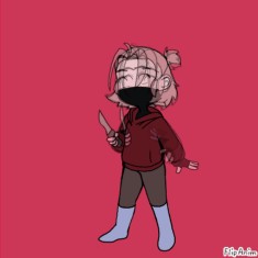
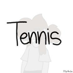
every aspect of this is the same colors. i just used the little bar and changed the shade of it. Just a bit of a lighter pallet makes all of the difference
18.12.2017 20:23
Link
Report
Is this comment inappropriate? Report it?
Yes
No
Thank you!
or you can copy the uncolored layer and then color. Make a new layer and paste it then color it :>
18.12.2017 20:24
Link
Report
Is this comment inappropriate? Report it?
Yes
No
Thank you!
or am I stupid TvT
18.12.2017 20:24
Link
Report
Is this comment inappropriate? Report it?
Yes
No
Thank you!
wut?
18.12.2017 20:26
Link
Report
Is this comment inappropriate? Report it?
Yes
No
Thank you!
idk :P
18.12.2017 20:27
Link
Report
Is this comment inappropriate? Report it?
Yes
No
Thank you!
i actually had no clue what that meant. im probably being stupid tho
18.12.2017 21:07
Link
Report
Is this comment inappropriate? Report it?
Yes
No
Thank you!
oh....
18.12.2017 20:22
Link
Report
Is this comment inappropriate? Report it?
Yes
No
Thank you!
The hot pink JIEJWCJHEJHJHWEED ME EYES (( dies )) This is very accurate though
18.12.2017 20:23
Link
Report
Is this comment inappropriate? Report it?
Yes
No
Thank you!
just to think its the same color as the pastel is strange.
18.12.2017 20:23
Link
Report
Is this comment inappropriate? Report it?
Yes
No
Thank you!
Very strange
18.12.2017 20:24
Link
Report
Is this comment inappropriate? Report it?
Yes
No
Thank you!
The “don’t” looks pretty okay though, I don’t see what’s so awful about a little saturation. The only reason it looks bad is because the colors already didn’t go together.
18.12.2017 20:26
Link
Report
Is this comment inappropriate? Report it?
Yes
No
Thank you!
the point of it is that neon colors arent always the best choice when it comes to making a pleasing to look at drawing. Both drawings use the same color just one is a different shade.
18.12.2017 20:28
Link
Report
Is this comment inappropriate? Report it?
Yes
No
Thank you!
Yeah you’re just saying the exact same thing you keep saying but what I’m trying to say I say that this is a bad example of that. I agree that overly neon colors aren’t the best idea in every circumstance, but sometimes they are appropriate and the “don’t” drawing doesn’t exhibit that problem but another coloring problem: not considering how colors go together
20.12.2017 06:45
Link
Report
Is this comment inappropriate? Report it?
Yes
No
Thank you!
HaH, I use neon all the time.
18.12.2017 20:32
Link
Report
Is this comment inappropriate? Report it?
Yes
No
Thank you!
There is no wrong color, you could use blindingly neon colors if you wanted as long as there was a context and it had a reason (like if your making an oc that’s really wild and flamboyant neon would be a good choice)
18.12.2017 20:37
Link
Report
Is this comment inappropriate? Report it?
Yes
No
Thank you!
^^^^^ SHE BE RIGHT
18.12.2017 20:49
Link
Report
Is this comment inappropriate? Report it?
Yes
No
Thank you!
The hair and the eyes don’t look good saturated, but I do like the clothes better pastel
20.12.2017 01:48
Link
Report
Is this comment inappropriate? Report it?
Yes
No
Thank you!
The "do" looks all washed out. I prefer the "don't" because it isn't really overly saturated. It's just... normal? Like, I get what you're saying, but this pallet looks better more saturated.
Login or register to post new comments.