dumb convo about simplistic ch


5 comments
pablofawkes[OP]
29.10.2018 17:55
LinkJust me talking about my dumb opinions for a bit. please don't comment in my thread.
Apparently I need to put in this disclaimer, you can draw however you want, I'm not saying you're wrong. I'm just talking about stuff I like or dislike. If I say something as if it's a fact, take it that I think it sounds better that way and it's just my opinion.
pablofawkes[OP]
29.10.2018 18:05
LinkI think some people on here think that their style is a simplistic style or a cartoon style, but for weird reasons.
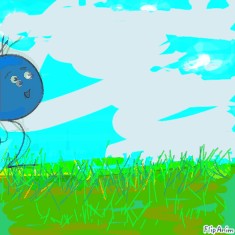
For example, they simplify the shape of a head to a circle. like, as close to perfect as they can get. same with eyes. In general I dislike this kind of drawing because the character doesn't look human. Take my very crude drawings as an example. the circle head looks goofy, even taken away from the rest of the body. Neat circles rarely appear in natural creatures, so the circle head makes it look inhuman.
The other awful drawing has a more deformed circular shape, but it looks more natural because it doesn't look geometrical.
Same with wide round eyes. really big eyes make the character look more artificial, like it's not a person. Slightly smaller round eyes, almond shaped eyes, or little dots look more real because your attention isn't drawn to them quite as much.
pablofawkes[OP]
29.10.2018 18:14
LinkRather than simplifying the torso to a few kind of blobby shapes, I often see bodies with a fair bit of anatomy put into them. Like they took quite a bit of figuring out. I think this kind of detail brings the less realistic aspect into focus. In my crappy version, the body looks like it could be tweaked a little and be a vaguely realistic style, if crudely drawn. The head, not so much. This disconnect looks bad to me.
A small neck is fine, but with a large head and a large-ish torso, a tiny thin stick neck looks really bad. like, cartoons don't need to stick to a realistic sense of logic, but the designs, I feel, should have a fairly consistent anatomy. A skinny neck looks like it doesn't belong with a big round head.
Limbs with the slightly more in depth design are often drawn as skinnier than they proportionally would be. This is a problem when the torso is a fairly proportionate somewhat realistic one. Much like the head, the torso makes the limbs look weird and alien.
pablofawkes[OP]
29.10.2018 18:16
Linkwhich is fine if you're drawing an Aline, not so much for a human.
However, with a vague blob of a body, nothing really looks weird in comparison, so stick limbs (as pictured) work just fine. However, slightly more thick proportionate limbs (as not pictured) work just as well.
That's the end of my whole... thing.
pablofawkes[OP]
29.10.2018 18:32
LinkPS all the things I said could potentially work if you're really good or you get lucky.


