

Trend I guess?

by:
GalaxyAnimation 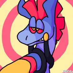 924
924
 924
924
04.08.2019

17 comments
GalaxyAnimation[OP]
04.08.2019 19:58
LinkI only will critique 1 piece at a time not your whole art style :3

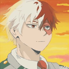
The shading could definitely be improved. The seam between the 2 types look a bit weird but it could easily be fixed. That's really all I have to say about it, this is really good!

I'm not one for anime, so I don't really know how to critique this?
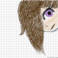
You probably could smooth out the lineart, it looks a bit sketchy. The head shape could improve, too. It doesn't quite fit with the body in my opinion.
I don't know if this is good or bad 'cause I don't know anime standards but good job :)


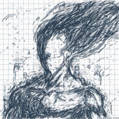
The hair shines are a bit too dramatic. The shading for the face is a little too dramatic and harsh as well. I really like the body shading, though, because it's a nice gradient. I think that when you used the small paint roller strands in the hair it made it look a little less professional, I think you should either do less hair strands in the shape or only make it have strands without the base. The background could improve,too. I don't know what it's supposed to be?
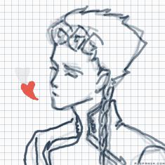
But I really like the art style and color choices, the red compliments the yellow really nicely! Good job uwu


I really like this one.
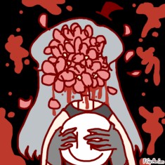
The left leg looks a little bit weird at the joint because it goes in a little too much. I think the blue and pink in the background could improve, as the paint roller is noticeable. I'm not really sure what's going on with their pose in that background? I fell like you could add more to that, to show what she's doing.
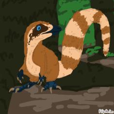
The background looks a bit rushed, you could have added more detail or maybe mushrooms or something around the tree. More lighting/shading would make it a lot more detailed. I love how you did the dinosaur, the shape and anatomy is perfect. The snout, if I can call it that, looks a bit odd at the tips where the mouth is.
Overall I really like this one, it's got a lot of potential!

The line art is a tad bit messy. I also recommend making the line art brown or black, too, but that's your choice. The dark brown lines in the hair look like scribbles (no offense)
I think you could've added more detail to it as well but if you were aiming for a simplistic style then that doesn't apply.

