- create flipbook animations online!
Login
Draw animation
Random animation
Browse animations
Followed users
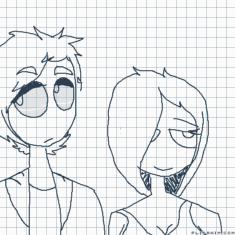
rejected
by. memestar
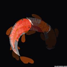
A fish because why not
by. Zee-rex
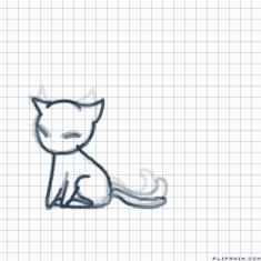
Untitled
by. Anonymous
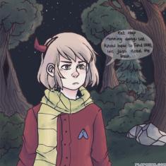
On Hallow's Eve- part 8
by. ShadowEyes
Future
by. chilifry
prince of all SONICS!!
by. TheBrianGrayShow
abandoned
by. Anonymous
Report animation reason:
Not marked as 18+
Other
Report
Cancel
Thank you for reporting any inappropriate animations!
Thank you! :)
Close
Your report will be soon checked.
Animation options:
Cancel
Good?
3
Like
GIF
Report
by:
Skelly
481
14.09.2019
FlipAnim uses Google Analytics for page statistics which uses cookies. Learn more about new
Privacy Policy
Accept