Chinese Dragon Head (Pt 1)


18 comments

Toxic-boi
27.01.2020 22:17
Linkmuch beautiful very like
2500696[OP]
27.01.2020 22:17
LinkTy :D
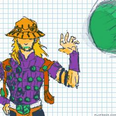
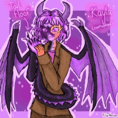
I'd say it could use some more outlines personally but I think it still works aesthetically. I'd also add some shading on the horn to make it look 3D like the scales.
The purple scales might need a slightly darker purple outlines to help show where one ends and another one begins. I really like the colors so nothing I'd add to that. Also since the head is a such a similar color to the rest, I'd just add a bit of shading to areas that wouldn't be in the light to add some depth, like behind the tuffs on the face and behind the horn.
These are just some design suggestions, I think it looks great as is though.

i think it looks better with no outline ssure they could darken the edges a bit but i like it with no defined line
