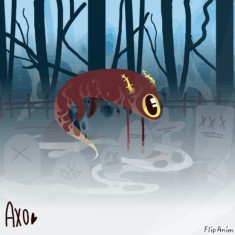
testing the editor


8 comments
redsnose[OP]
01.01.2019 21:40
Linkik its still in beta and i doubt flips gonna see this but i still wanna give my thoughts on it.
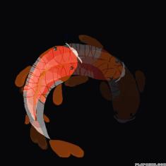
to start, i really hope that the layers have an opacity setting later on that i can use to make some layers more transparent than others, because if that happens then i can actually make lineless art on here. you can go to both these links to see some of my lineless pieces:
https://www.paigeeworld.com/u/princeofpans
https://drawn.digifi.ca/album/32
id love to be able to actually post decent art on here but its definitely less likely if i can change the opacity on the layers on here.
also, i think instead of the bulky square pop up in the editor (if thats what youre putting into it) you should have a color wheel on the side. its convenient for quickly figuring out what complementary colors you want to use and i think itd just be easier than the square.
these are only suggestions, no one needs to take them to heart or anything, id just love to see this site improve a little bit more because as of now i dont

redsnose[OP]
01.01.2019 21:41
Linkvery confident in making finished colored art on here. this site still serves as my shitpost haven, where i only make character designs and draw porn. i want that to change.
When you say bulky pop up square are you referring to the custom colors in the previous editor (because I can't think of what else you'd mean), because the way you get custom colors depends on the device you're using. My Chromebook pops up a square but on a Mac a color wheel shows up. (it also provides a year dropper that can take color from anywhere on the computer)
