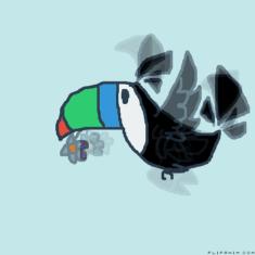
okay first off i love your style, it really does pop off, also your anatomy is pretty good i think you should shade a bit more and try new background (though i know it can be hard to think of some) also your colors are very nice looking so id say 8/10!
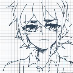
oh man, your lineart is very smooth, and your character designs are neat, your expresions are a bit hard to tell but that might be cause of your style, also i think you should work on your highlights a bit i recomend doing a lower capacity
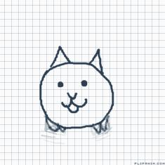
very simple, i see that you might be new and thats fine sense your gettting used to everything, i think you might want a skinner pencil for one and maybe try using diffrent colors, and if you wanna try, try some shading! but your good for being new!
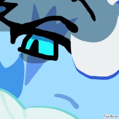
your dinosaurs are awesome dude, and i love how you shaded the colors around the neck, ya might wanna ease up on the black a bit and try a cool background (but as i said before it can be hard) also your color sceme is very nice and pleasing to look at
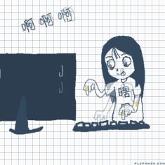
pretty imprseive! i think you should work on some tweening but it is diffucult, also you may wanna add more detail (though yes, this is an animation meme so you dont need to add alot ) also your expressions are very nice.
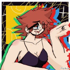
a bit messy but it looks neat when pulled together by the neonish colors, i think you should work on anatomy a bit, but thats about it, your background is exilent and if you didnt make that background i myself would have also i love the affects with the blue red and green
Ty :DD
Also, like I said before, this is a seperate style that is meant to be cartoony and a bit unrealistic. But thank you, I'll work on my anatomy lol
very neat, i like the hair and background, i think you should work on details, like wrinkles in clothes, and maybe change the color sceme of the shirt to match more with the hair and skirt but as i said the hair is very neat and so is the background you worked good on this