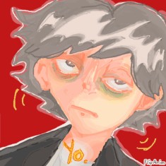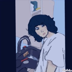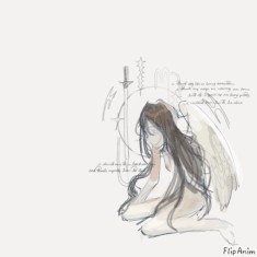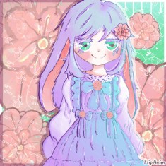
"You spin me right round"
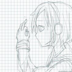
hitorie one-me tuor
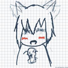
loveless立夏草灯
Untitled

Xylophone Ringtone

王马大总统
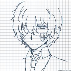
Untitled
ill critique ur art!!


51 comments

MYOhSeeS[OP]
29.03.2023 18:18
Linkim not a profesioenal this will just be based off of what i know and my preferences n art
send 1 only 1 piece pls and ill critique it
:D

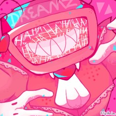
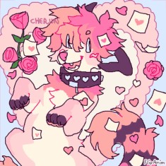
the colors u use r rlly nice but i feel like when u put that layer of pinkish color over it takes a bit away from the piece- u could try making a layer above and putting some highlights around the character or wherever the light source is^^ also try using different color schemes u seem to use alot of bright pink colors which is totally fine but itd be cool to see some different colorsz frm u^^ also i notice in alot of ur pieces they seem very 2d and flat so try n study 3d objects n think of the character as 3d instead of 2d when u draw them. also adding some different line thicknesses (like making it thicker where corners meet in the lineart) can give it some depth-
ur art is great tho n dont put too much pressure on urself to improve bec u will overtime
lovely art tho:)

SHE SLAYYY
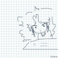
shes uncolored so i don have anything to say bout the colorfs
but damn those eyes😳😳😳
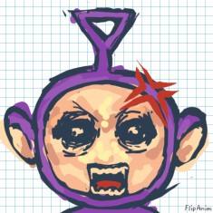
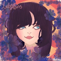
anyways her expression is kinda confusing bec her eyebrows are indicating shes sad or upset, but she has her tongue sticking out so maybe try practicing expressions a bit? they r pretty easy to study n u could try practicin by looking at references of diff expressions n drawing those^^ ur lineart seems a bit messy that can be nice sometimes but try n use smoother lines for like the face n stuff because the skin is usually smooth- u could also incorporate some thicker lines in the parts of the lineart where theres corners n important parts of the face^^ also for the shading dont be shy!! add darking shading around the har n stuff u can define it better doing that and u could shape the shading into hair strands so the hair looks more hairy😭idk why i said that
but got damn those eyes🥺

vry cute bunni i dont think i have much critique
only things i notice is the bunny is off center n theres alot of empty space so maybe put them in the middle? also the curve of the top of the wing is a bit off looking the curve usually happens at the middle i believe. u could also make it pop more by adding a brighter highlight n then putting a vry bright pink next to it would look rlly cool- also it seems to be lacking an expression maybe giving it a little eyebrow? n make it sad?

can i just say i love ur style so much🥺🥺🥺
honestly don have much
u could add a brighter highlight on the hair^^
maybe some cheek flush thatd look cute^^
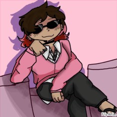
also ur lines seem a bit sketchy try n be more confident w ur lineart^^ just adding som basic shading to the hair and suite would go a long way- n her hand is a bit confusing
but like ur art tho😳😳😳😳😳😳

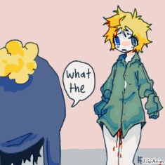
hmm its a ref i dont have much to say tbh
cute style tho omg
u could add a shiny highlight on the hair thatd look rlly nice n focus more of the attention on her face^^ also the bg color is rlly saturated n kinda distracting maybe something a bit lighter?^^
maybe give her some eyebrows n define her expression a bit more^^
also i feel like she should be more in the center of the page bec she is the main focus

love the colors and textures sm!!
few things i notice is the anatomy could do some work- try practicing from reference when u draw fb characters^^ shes kinda lacking an expression and giving her one would make the piece alot more interesting^^ also some different highlights on the hair like if you added an orange color itd look rlly nice- also working on poses too!! use references w that but makin the pose more dynamic will make the piece more interesting for sure

lovely colors shawty
i feel like u could make the colors pop even more by adding a lightsource maybe on the plants or somethin
also i feel like theres alot of empty space above the character so just moving it up a bit would fix that or even making it bigger
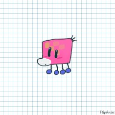
maybe giving it an interesting expression would give the char a more interesting personality would be cool!! i think its a cow? try studying from some refs- even drawings would be good! and u could add some leaves blowing to add movement to the piece^^ very cool overall

SHE GAY SO EXTRA POINTS SHAWTY
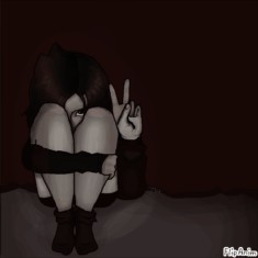
her sitting pose is a bit awkward- next time you want to draw a pose and arent 100% sure how always turn to a reference!! youll learn so much just from using them and improve alot^^ also the blocks arent really following any perspective- try and imagine them in 3d space- or even just practicing drawing blocks from reference photos or irl will def help!!
also you have some nice shadows going on but there isnt much of a lighting going on- just adding some simple lighting on the opposite side of the shadows will give it some pop!! love her expression she slayinh

😳💅ur style oh my
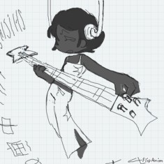
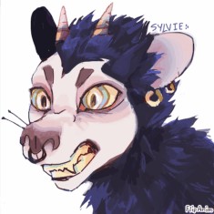
the back leg seems a bit wonky to me- just studying a few animal anatomy refs could help^^ some basic shading under then neck, around the front arm and other places would definitely make it look more 3d- maybe put something around the char that represents them- like lightning or something thatd look cool- the face is the focal point adding some shading and highlights to the eyes would look nice- and some highlights on the hair^^
Comment removed

ik u wanted my to critique cuz u asked ima do urs early :P
very cool perspective love the idea oml
hmm i think the eyes are more in the bg so they should be a darker shade cuz they kinda are taking away from the focal point- also the eyes all look very different and a bit wonkey- maybe making them all in a circle looking at her. and u could add a highlight on them bec theres glowing from the thing she is eating. also maybe instead of the glowing food being white maybe make it red or yellow itd give it a more interesting feel and you could add some color on the surroundings. the clothes feel a bit flat imagine that theres a 3d object under there- using reference for poses like this will rlly help^^ love the expression
