Hand in a paper
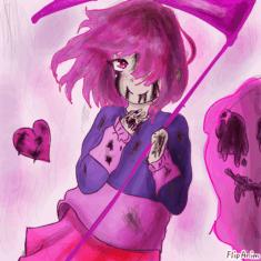
Betty Noire (Glitchtale)
Because I got Bored. ._. .-.

W
Cute Kitty :3
Sketches
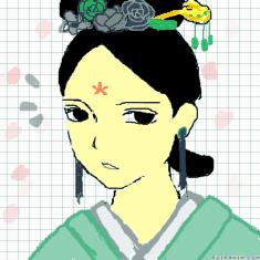
Untitled
Untitled

115 comments

Glermaneon[OP]
14.04.2024 22:13
Link
Glermaneon[OP]
14.04.2024 22:14
Linkfor some people i might not have much of an opinion, and with others i might. it all really depends.
also, this is just for fun, and its just my opinion. dont get yourself down and think your art SUCKS because i said i didnt like it or something, thats not true. keep drawing.
Comment removed

Glermaneon[OP]
14.04.2024 22:15
Linkplease give your best examples if i dont really know you…
also, this is characters and character designs too

I don’t care for your art very much, unfortunately. It seems to change alot, which isn’t really a bad thing since that’s how you grow as an artist. You don’t have to stick to one artstyle. But, it does remind me of my old art from a few years ago. It’s not much, and I find the colors to be a little messy. It’s certainly not for me, but I can’t say the same for others

I would give something better if I had more examples, but since I don’t I’ll say a few things.
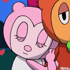
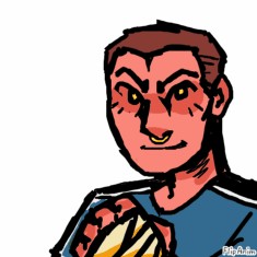
I like the thick outer lineart, and the line weight gives a more interesting look. I really like how you draw the eyes, it’s very clean. Some of the lineart in the drawing does seem too light and doesn’t allow for the blue color to really pop, but it’s nice nonetheless. It sort of reminds me of the old Strawberry Shortcake artstyle, but also just older styles like that in general. It’s alright,

I think your art is overall alright, although it doesn’t stick out to me. The art in your profile picture, I like it. I love how colorful it is, yet its not cluttered as theres only three main colors in the image. It’s pleasing to look at, and leads your eyes through the drawing. Otherwise, your art simply isn’t my cup of tea.

I think you’re good..
Anyways, DON’T EVEN GET ME STARTED
Your art has always interested me. It’s so soft on the eyes, and the rendering is wonderful to look at. I love the thin lineart aswell, it gives more room for the colors and is overall pleasing. If this is what you have on Flipanim, then I can’t even imagine how great your artwork is offsite. Even your doodles are wonderful to me. I think your anatomy is pretty good, too. Overall, I absolutely adore your work and would love to see more from you :>>

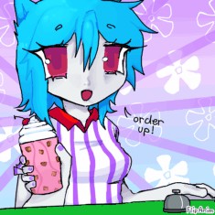
I really do like your art! You have a very recognizable artstyle. I enjoy it, and the vibrant colors along with the bouncy shapes make it fun to look through. It’s all cartoony. Your colors CAN be awkward sometimes, but that doesn’t take away much usually. Overall, I think it’s pretty great. I like to come across it

thank you!
Your art strangely reminds me of some artists you’d see on Youtube? I can’t remember exactly which artists, but just Youtube in general. This causes me to admire it a bit. The colors are vibrant and usually go well with eachother, but the only thing I have to say I don’t like is that it’s rather flat. Of course, this can be a stylistic choice, so not much of an issue, but yeah! Your art is nice ^^
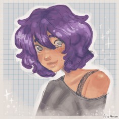
i hope this isn’t too much! i wouldve showed more but i feel like this is a lot already
you’ll be seeing this character only, because she’s my main and i usually only ever have motivation to draw her!
https://paste.pics/QQWRN
https://paste.pics/QQWRL
https://paste.pics/QQWRI (i hate one of the doodles on this, it looks goofy bc i rushed it SORRYY)
this one was more of a quick test so it’s not really my artstyle ! https://paste.pics/QQWRG

Your art is actually sooo soo so pretty! I love the first pastepics, I think you captured the emotion of her crying well. I love the vibrant colors on the hair and how you highlight it and add details. I just overall like how you draw the body and stuff, it’s neat. Your shading is a little messy for me on Flipanim, but offsite it looks just fine! I love your art, it feels sweet like strawberry candies!

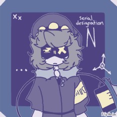
um um none of my recent art been too good but ill pull the ones im atleast semi proud of (keep in mind its not rlly my artstyle, im just rusty w the trackpad)

You art sort of does give me a nostalgic feeling like creativecat, and it reminds me of 2020. Like Awrly on Youtube and stuff. Some of your drawings, like your profile picture, are stunning. The arm isn’t the main focus of course, but it is a little bit wonky in my opinion. Overall, I don’t pay much attention to that as I’m drawn to the cigarette. I love how the orange glow pops on the dark background, you did a great job with that composition, although it could’ve had more emphasis if the main character was centered in the square.
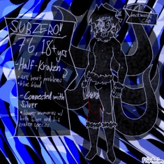
Since you post a few designs, I’ll include that. I’m not a fan of your designs most of the time, although there are some I do like. The colors are unfitting, or the pattern is awkward to look at. Not my cup of tea.
Comment removed

Your art isn’t really my thing, and it seems a little messy. I’m sure I would like some of your drawings, but just from these three I don’t notice them much. The first one, the only thing I don’t like is the dull colors of the lineart. It just makes it feel, ehhh.. The second one would probably be my favorite since I really like the purple! But yeah, your arts just fine,


