- create flipbook animations online!
Login
brutally honest improvised
GIF
Report
18.03.2020
21 comments
18.03.2020 01:25
Link
Report
Is this comment inappropriate? Report it?
Yes
No
Thank you!
Go on
18.03.2020 01:29
Link
Report
Is this comment inappropriate? Report it?
Yes
No
Thank you!
18.03.2020 01:34
Link
Report
Is this comment inappropriate? Report it?
Yes
No
Thank you!
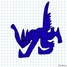
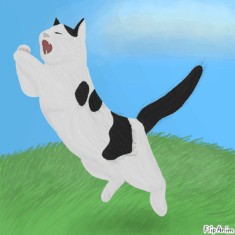
The background again is blank, which makes the character float when it isn't. Add a small shadow underneath so it doesn't float.
18.03.2020 01:27
Link
Report
Is this comment inappropriate? Report it?
Yes
No
Thank you!
the beautifuls dog
18.03.2020 01:28
Link
Report
Is this comment inappropriate? Report it?
Yes
No
Thank you!
and invisible samurai sword
18.03.2020 01:31
Link
Report
Is this comment inappropriate? Report it?
Yes
No
Thank you!
1. The beautiful doggo It doesn't really have a background, which makes it look like it's floating. Maybe you could add a shadow underneath so it doesn't float. 2. Invisible samurai sword Ha there's nothing wrong with this.
18.03.2020 01:32
Link
Report
Is this comment inappropriate? Report it?
Yes
No
Thank you!
1. beautifuls doggo was made to annoy Lilly 2. yes
18.03.2020 01:27
Link
Report
Is this comment inappropriate? Report it?
Yes
No
Thank you!
Dfvsfhbvjhbvmsdfjhb
18.03.2020 01:32
Link
Report
Is this comment inappropriate? Report it?
Yes
No
Thank you!
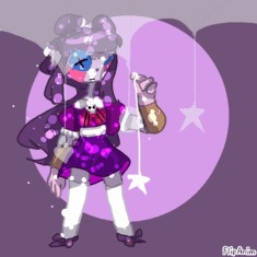
This one seems to be a bit over detailed. Maybe remove the layer you used for the outline, because it has excessive details in it. Overall, this is really cool to look at.
18.03.2020 01:33
Link
Report
Is this comment inappropriate? Report it?
Yes
No
Thank you!
Is this better??
18.03.2020 01:35
Link
Report
Is this comment inappropriate? Report it?
Yes
No
Thank you!
yes ty brudda
18.03.2020 01:35
Link
Report
Is this comment inappropriate? Report it?
Yes
No
Thank you!
np sister
18.03.2020 01:38
Link
Report
Is this comment inappropriate? Report it?
Yes
No
Thank you!
How's this?
18.03.2020 01:41
Link
Report
Is this comment inappropriate? Report it?
Yes
No
Thank you!
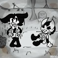
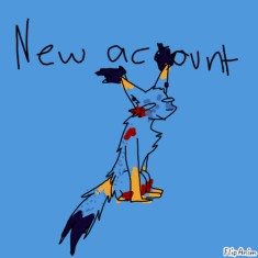
The head seems to be bigger than the body. Make the head smaller but a teensy bit bigger than the body, not too far though. There should be details like shading and more outlines to the background and the art itself. There also seems to be little movement to this anim. Try adding more animations on everything.
18.03.2020 01:42
Link
Report
Is this comment inappropriate? Report it?
Yes
No
Thank you!
I kind of rushed it tbh
18.03.2020 01:44
Link
Report
Is this comment inappropriate? Report it?
Yes
No
Thank you!
Well it takes time to finish a masterpiece. Take your time and try to finish it.
18.03.2020 04:08
Link
Report
Is this comment inappropriate? Report it?
Yes
No
Thank you!
anne boleyn
18.03.2020 04:10
Link
Report
Is this comment inappropriate? Report it?
Yes
No
Thank you!
and my child murdering gf
18.03.2020 04:14
Link
Report
Is this comment inappropriate? Report it?
Yes
No
Thank you!
and eboy
18.03.2020 21:23
Link
Report
Is this comment inappropriate? Report it?
Yes
No
Thank you!
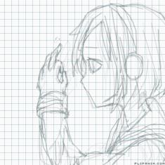
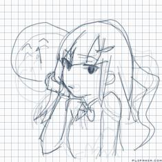
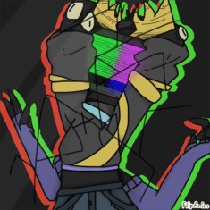
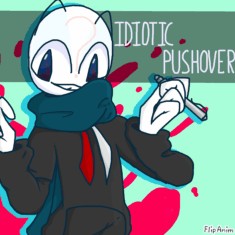
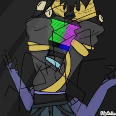
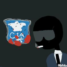
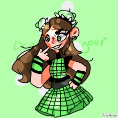
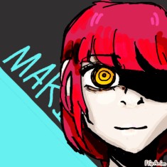
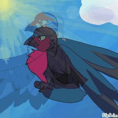
1. Anne boleyn The hair seems to be a bit overdetailed and the dress looks exaggerating. Reduce the patterns on the dress and add less detail to the hair. 2. Buttons Like the first anim, you put excessive detail. Reduce the detail part so it looks good. 3. eboy The arms seem to get bigger when you animate it. Make sure that the arms are the same size as the first part.
18.03.2020 21:53
Link
Report
Is this comment inappropriate? Report it?
Yes
No
Thank you!
anne boleyn's design in six is exaggerated
Login or register to post new comments.