Dragon


98 comments
MooncIoud
17.08.2019 14:55
LinkWOAH AWESOMEEEEEE
VoidChipz[OP]
17.08.2019 14:55
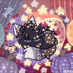
LinkThanks. Took an hour
NekoTord
17.08.2019 14:55
LinkAAAAAAAAAAAAAAAAAAAAA SOOO COOOOOOL!!!!&
VoidChipz[OP]
17.08.2019 14:56
LinkTyvm
Windows95bro
17.08.2019 14:56
LinkSHOULD HAVE MORE ATTENTION OMG
VoidChipz[OP]
17.08.2019 14:56
LinkTook like an hour but yeah i thought it could be on popular
Slovakia--
17.08.2019 14:57
LinkIt has very messy shading through i doubt it will.
VoidChipz[OP]
17.08.2019 14:58
LinkI`m not great at it
NekoTord
17.08.2019 15:05
LinkSo? At least u did ur best!
VoidChipz[OP]
17.08.2019 15:06
LinkYyeah
Memekiller10
17.08.2019 15:35
LinkWow I am speechless
You did amazing work <3
Comment removed
Shading is where exactly? It's messy and there's no sense of lighting
Highlights would be nice.
Maybe a background that makes sense?
Yes it does.
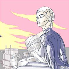
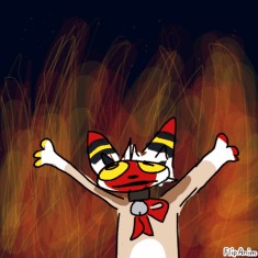
But I'll try to give some pointers for improvement. The shading/coloring and oversaturated colors isn't what I personally find to be the "sucky" part. I think you could improve the anatomy and lineart of the creature. Think of how the bones and muscles would look under it. Look at the wings of a bat, or just look up dragon wings, to improve the anatomy of the wings. Use smaller lines or color the lines something instead of black.
For the background maybe make it look more cave-like, it's fairly easy to make a simple cave background. And when shading make sure things only look oversaturated if they're supposed to be glowing or something.
(because you deleted the "it sucks" anim, this is what I was typing)

Please do not advertise, I'm glad you feel good about it but I don't care (no offense) at all about it. I would maybe think better of it if you wouldn't advertise it, because you're stealing somebody else's spotlight. Stop. Please do not answer with "Oh I'm so sorry!" And please just stop. I'm sorry if this was rude, advertisers just kinda piss me off.
