- create flipbook animations online!
Login
Key is this ok so far?
GIF
Report
02.09.2020
14 comments
02.09.2020 09:59
Link
Report
Is this comment inappropriate? Report it?
Yes
No
Thank you!
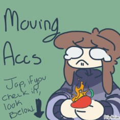
I don’t like how the design is laid out but I am proud of how the anatomy looks at least If you don’t like it I’m fine with redoing it, I saved the lineart
02.09.2020 10:05
Link
Report
Is this comment inappropriate? Report it?
Yes
No
Thank you!
I think imma redo it It’s starting to bother me lol
Comment removed
02.09.2020 10:29
Link
Report
Is this comment inappropriate? Report it?
Yes
No
Thank you!
Actually gonna draw Vulcan since I’ve been sketching this pose for a while now, and then give you a chance to reply incase u are asleep or something
02.09.2020 11:34
Link
Report
Is this comment inappropriate? Report it?
Yes
No
Thank you!
I ****ING LOVE IT
02.09.2020 11:34
Link
Report
Is this comment inappropriate? Report it?
Yes
No
Thank you!
YES THIS IS AMAZING
02.09.2020 11:35
Link
Report
Is this comment inappropriate? Report it?
Yes
No
Thank you!
I LOVE THE DESIGN, PLEASE KEEP IT AS IS
02.09.2020 11:37
Link
Report
Is this comment inappropriate? Report it?
Yes
No
Thank you!
I think the only thing that's very, very slightly bothering me is the grey, if it was a little darker it'd REALLY bring out the colors!! But everything else is literally perfect I love him
02.09.2020 11:38
Link
Report
Is this comment inappropriate? Report it?
Yes
No
Thank you!
some of the blues are little muted out by the grey in some places
02.09.2020 11:41
Link
Report
Is this comment inappropriate? Report it?
Yes
No
Thank you!
like the darker grey spots, that color is the exact color I'm talking about, make that the 'base' grey make the darker spots a bit darker so you can still keep them in the design. If you can't change it without coloring over the pattern, then that's okay!
02.09.2020 11:49
Link
Report
Is this comment inappropriate? Report it?
Yes
No
Thank you!
Sorry I'm a bit excited because this design is amazing. Lemme rephrase that so it's easier to understand. The darker color grey in your design is perfect for what I want the base grey (intermediate between the darker and the belly) to be, because some of the blues are a little muted in some spots. Then if course darken the dark spots so they can still stand out as their own color. If you can't edit the base colors without destroying the patterns then its okay!! I can do it when I go to draw them. (If you're okay with the slight redesign.)
02.09.2020 11:50
Link
Report
Is this comment inappropriate? Report it?
Yes
No
Thank you!
but like, everything else about this character is absolutely stunning. I even love the shape of the patterns and everything. I absolutely love the saturation in the colors.
02.09.2020 12:04
Link
Report
Is this comment inappropriate? Report it?
Yes
No
Thank you!
Actually for this I was testing a new way to design so the base, accents, and secondary are all different layers so it’ll be pretty easy to adjust the colors I think you’re on to something to so I’ll get to it once I get Vulcans spines inked out Also should I darken the belly just a little as well? I’m noticing on the face it’s making the blue look a little odd, but that might just be my own color blindness fighting against me lol
02.09.2020 12:06
Link
Report
Is this comment inappropriate? Report it?
Yes
No
Thank you!
Yeah, that could work!! But obviously still keep it a good bit lighter than everything else
02.09.2020 12:27
Link
Report
Is this comment inappropriate? Report it?
Yes
No
Thank you!
Well honestly for that shade of grey I believe I used teal to get to it, and everything else was blue so it gonna be lighter anyway
Login or register to post new comments.