- create flipbook animations online!
Login
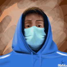
Quick sketch of me
by. ProMagma
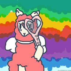
DONE!!!!!!!!
by. BnHa558MaR1N2
copycat meme X3
by. shyroselove
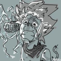
Even Brave Men Cry
by. vegeto123
ggg
by. waltz
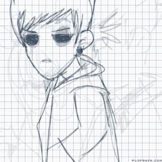
life of eli
by. captleibniz
滑雪
by. Anonymous
Report animation reason:
Not marked as 18+
Other
Report
Cancel
Thank you for reporting any inappropriate animations!
Thank you! :)
Close
Your report will be soon checked.
Animation options:
Cancel
Rating time! LMT please
5
Like
GIF
Report
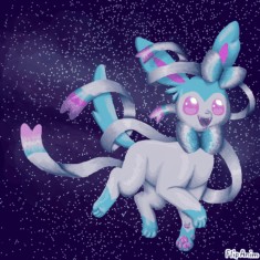
by:
Moonstar
767
17.11.2021
FlipAnim uses Google Analytics for page statistics which uses cookies. Learn more about new
Privacy Policy
Accept