- create flipbook animations online!
Login
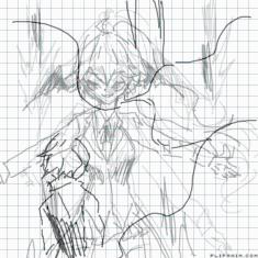
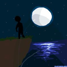
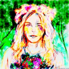
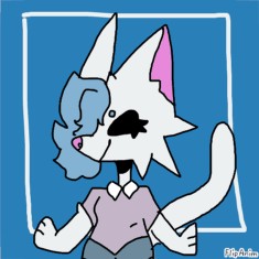
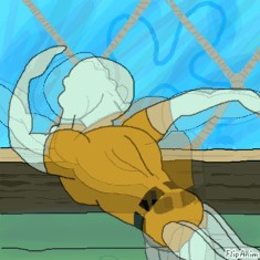
So,,,,is this improvement or,,
GIF
Report
27.10.2020
14 comments
27.10.2020 16:30
Link
Report
Is this comment inappropriate? Report it?
Yes
No
Thank you!
;-;
27.10.2020 16:32
Link
Report
Is this comment inappropriate? Report it?
Yes
No
Thank you!
:3
27.10.2020 16:51
Link
Report
Is this comment inappropriate? Report it?
Yes
No
Thank you!
^^
27.10.2020 16:56
Link
Report
Is this comment inappropriate? Report it?
Yes
No
Thank you!
Advertising for them: they said they spent about five hours on this and they wanted to have a little more credit im guessing so y e a h
27.10.2020 18:02
Link
Report
Is this comment inappropriate? Report it?
Yes
No
Thank you!
So nobody is gonna tell me if I improved or not because I don't understand how my art looks to yall :') ;-;
Comment removed
27.10.2020 23:29
Link
Report
Is this comment inappropriate? Report it?
Yes
No
Thank you!
This looks amazing!! I have some suggestions, lemme type
27.10.2020 23:38
Link
Report
Is this comment inappropriate? Report it?
Yes
No
Thank you!
Alrighty, so it would be even better if you could improve on the hair a bit! Add more detail inside the hair and give it more volume. Loow at other people's styles for examples. Use less jagged lines for the bangs and have more consistency with what direction they're going in. It might look nice if you give the shoulders more of a curve instead of them ending at a point, but that's more of a stylistic thing than an objective critique. Since there is a shadow behind her, that would mean that her whole body should be enveloped in shadow instead of shading on one side. Perhaps, depending on how big the shadow is, she may have some lighter spots around the edges, but that shadow looks too big for that. Your style might look nice with a nose, but that's up to you depending on what you're going for. Just know that there are many ways to simplify noses and ears, and they can really help make your drawing look more humanoid. I like your usage of wrinkles on the sleeves, and the heart is a good edition to the
27.10.2020 23:43
Link
Report
Is this comment inappropriate? Report it?
Yes
No
Thank you!
shirt, since you can curve it with her chest, making her look more 3-dimensional. Also, her chest is well drawn, but realistically it would be slightly lower down, unless the character was wearing a push-up bra or anything else along those lines. I love the colors you used, and I appreciate that you made them relatively desaturated to fit the mood of the drawing. A suggestion on the eyes, if you want to really push her worried expression you can and a slight darkness or small lines under the corner of the eye closets to the center of the face. This resembles bags and can make the character look more tired, wary, anxious, and/or stressed.
Comment removed
27.10.2020 23:45
Link
Report
Is this comment inappropriate? Report it?
Yes
No
Thank you!
*closest ^^.
27.10.2020 23:49
Link
Report
Is this comment inappropriate? Report it?
Yes
No
Thank you!
Anyways, you're improving a ton really quickly, and I can't wait to see how your art looks in the future!! :>
27.10.2020 23:53
Link
Report
Is this comment inappropriate? Report it?
Yes
No
Thank you!
The shadow critique was based on if it was someone else's shadow, btw. If it's hers then the whole part of her body that's facing forward would be lit up. The shadow would be slanted narrowly to her left if it's hers with the way the lighting is rn.
28.10.2020 00:13
Link
Report
Is this comment inappropriate? Report it?
Yes
No
Thank you!
Ok thank you for the suggestions And yes that's somebody else's shadow But thank you so much I really appreciate the suggestions and I hope I could be able to improve even more in the future ☺️
28.10.2020 01:28
Link
Report
Is this comment inappropriate? Report it?
Yes
No
Thank you!
AA you're welcome!! ^_^
28.10.2020 01:32
Link
Report
Is this comment inappropriate? Report it?
Yes
No
Thank you!
^^
Login or register to post new comments.