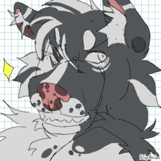
ill rate ur art n give advice


52 comments

MYOhSeeS[OP]
07.01.2023 03:34
Link
MYOhSeeS[OP]
07.01.2023 03:35
Linkok so comment ONE piece you want critiqued and ill give an HONEST rating n some advice from my small pee brain
(this is entirely based on my opinion art is subjective)
https://f2.toyhou.se/file/f2-toyhou-se/images/59304394_4FHoBQzXEQPtTbk.png
would be cool to get some critique on this piece

8/10
Absolutely love your style definitely deserves an 8 its so unique and kawaii.
a few things you could work on is anatomy, the front of the cats legs is a bit too low compared to the back they are usually at equal lengths unless its bending them. you have very clean lines you could try adding some thicker lines in spots where lines meet, like where the bat wings connect with the torso it may help but this is up to you. Adding more shading like to the legs that are further and instead of using a darker purple to shade try using a dark blue. lovely piece ^^

ok im gonna rate the first one^^
8.9/10
lovely style its seggsy yes
The sketchy lines are a way to stylize but I feel like a stronger cleaner outline of the pig would make the piece a bit nicer. The lighting is a bit dull I feel like theres a lot of potential; adding some more brighter more bold highlights will definitely make it pop and give it that 3d feel. The expression is a bit stiff on the pig im not sure how he feels- you could try messing w the eyebrows and mouth so maybe a murderess grin. the dog looks a bit squished maybe putting him more on the screen poor baby. the red part of the clothing looks a bit stiff cuz theres no folds- try searching references for the pose that your using^^ (idk how ppl even do clothing wrinkles tbh)
thats bout it very hot art 🥺

6/10
ngl that looks like a snacc
never had fried milk sounds interestinG
okay so i dont have the reference imagine to base it off of but a few things you could fix is the wood in the background is very sharp and distracts the eye a bit so try and make that smoother because the eye focuses on detail first. instead of outlining the fried milk with black you could try using a dark red to make it more believable. you could also make the bowl shape a bit rounder and maybe try adding some white highlights on the milks itll make em look shinyyyy
yum

8/10
ur style is hot eats
ok so the green, blue, and yellow could work better if you tuned down the saturation of the background color a bit so we can focus on the character more. the head placement on the torso isnt centered if you measure the right side to the left, so just centering your head in the sketching stage is a quick fix. the red highlights are pretty but because the bg is yellow and green it is a bit confusing so it looks a bit miss placed. you could try highlighting it with a bright yellow and then add some red itll make it all glowy. you could make folds in the clothes to make it more believable. the mouth does look a bit weird since the head is in a 3/4 position so you'd only be able to see about half the mouth but it looks like a stylistic choice so its totally up to you what you wanna do^^
😤nice arts

me neither but your art is a gem😩
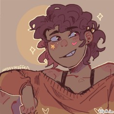
9.5/10 IM RATING IT THIS HIGH CUZS LIKE
hot style+hot highlights+hot colors thats like alot of hot things ok
you could def work on expressions^^ they are smiling so their eyebrows would be raised higher and dont be afraid to add dimples!! itll make it so much more expressive^^ the highlights r a bit confusing they look randomly placed- try n think of a light source before u go in w highlights- for example if it was coming from the top left that whole side would be getting hit so you'd highlight that. and for the shading you could give the hair and clothes a lot more depth by having that light source and then shading the opposite side(where the light is not hitting) some nice orange lighting would look rlly good too^^
lob ur art 🥺🥺😤

4/10
im scared they gonna bite me
ok so i dont have the ref but the bottom jaw looks a bit rubbery(whatever that means) remember under all that fur there is a bone structure try to follow that (bones cannot bend) I recommend studying reference photos of wolf skulls- that will help your underlying foundation n youll make stronger pieces^^
lovely work😤

7.5/10 ok. iwill not mention coloring lol
solid style love love the thick and thin lines gives it alot of depth
the torso looks a bit flat def recommend studying sum anatomy^^ try and think about how the clothes fits on the character- and also what kind of cloth it is that will affect how it folds. clothing looks a bit boxy and needs da wrinkles(use references!) the eyes are a bit too close together so just movin them a little will fix that. the bg perspective is a bit wonky the building closest to the character and the one behind it are on 2 different perspectives (try lining the bg on a tf is it called lining grid or somethning) im running out of energy fgjdf
secssy arts 😩😩
