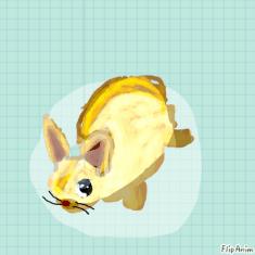
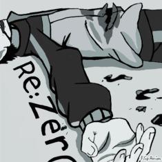
idk I'll critique your art hah

31 comments
Navii1[OP]
13.10.2019 16:06
LinkI'll be honest wjxj
I'm not a good critique but I'll try my best

yeet alright uh
I love everything about it obviously lmao
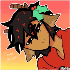
But if this annoys some people, the shading on the hair seems a bit strange only because you can see the lines from the shading
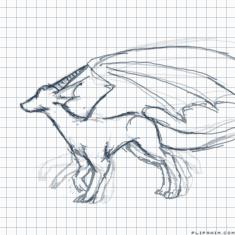
The jaw from the animal kinda seems off,, its looks a bit square-ish near the front unless that's what you wanted
That's literally the only flaws I see lmao

Okay I see some things
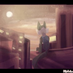
The shading is a bit too unrealistic (not that you have to make it realistic or anything) it just seems a bit weird, even with the background, I'd suggest if theres some bright light behind the character you can put some shiny outlines around the character to make it more intriguing
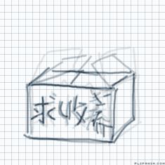
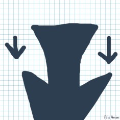
The perspective needs practice because the table looks very slim and if you want it like the cameras on the table you might need to make the table more wider at the sides
The exit sign feels crooked, but you dont have to do anything about that
The last thing is the lineart colour, you can make it more brighter if you wanted instead of black, imo black is really dull to use if your trying to do a glowing background behind it
That's all I got c:

u h
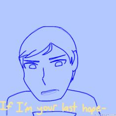
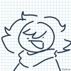
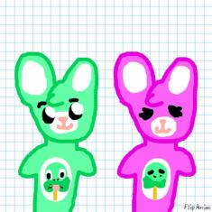
Your lines on your characters when you dont do realism look very weird, like the animals head might look squished n stuff
The colours are also sometimes very bright and could hurt the eyes, maybe use pastel or grey-ish colours to fix that
Shading is 👌, just need to know more about 3d surfaces and where the shading must go
