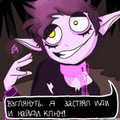
Carver did an oOPsie
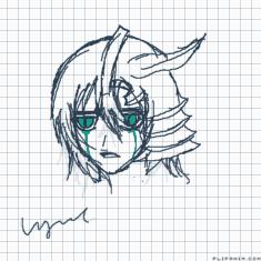
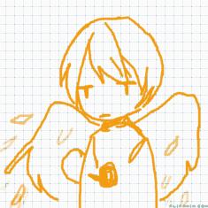
Ulquiorra
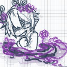
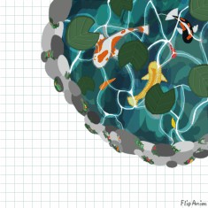
Untitled

hey guys pisces here :3 :3 :3
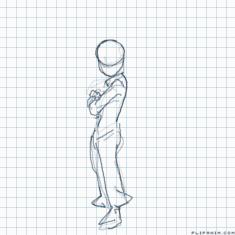
shitthrow
Art stuff you might need 2 kno
大天狗
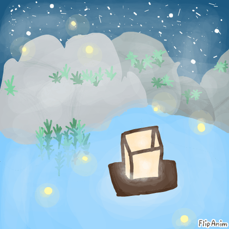
{~Lattern in the Spring~}

10 comments

Captain-Mangle
09.03.2020 06:53
LinkThat’s beautiful

Uniwolf[OP]
09.03.2020 06:53
LinkThank u :D


So, here we have a piece, which doesn't necessarily states a certain message or opinion, but rather is intended to create a specific atmosphere
To me, it's a lantern floating on the water. At first glance I thought it was snowing, but now it looks like the night sky to me.
Artstyle
I would consider this to be a rather realistic approach, than a comic or illustration approach. It isn't abstract either. It's outline-less.
So in that case this would be compared with a beautiful scenery like this the real world.
If the background is indeed night sky and stars, I would make them more even in size and overall smaller and a little bit transparent.
Shading
There is almost no shading, it's almost more lighting than shading in this piece. And that's not necessarily bad, in fact, it underlines the intended impression and is perfectly valid. Lighting is overall smooth and IMO you achieved your goal when it comes to the atmosphere.
Colors
The colors are rather flat with lower saturation, which again, is a good thing as it underlines what you intended to do. You picked only a few colors and used a complementary contrast, which intensifies the luminance. Maybe this is a little to powerful to be calming, and a light shift to red would shift the impression more to calming. Overall I think it is a little bright as well, just darkening every color just a bit could change the resulting athmosphere (maybe more to what you intended it to be (if I am correct about what your intensions are)).
Perspective
Oh I nearly forgot this important part:
The top of the lantern makes it pretty clear what the perspective of your art is. The viewer looks on it rather from top, that means, everything else (including the water, the rocks and the whole horizon) has to follow that rule as well. It's not that it doesn't in your case.
Let's assume that the rocks are on a hill or mountain, then the perspective is consistent with the lantern. Otherwise, you should be able to see the horizon, if you know what I mean. If that's out of the way there is still something a bit off with the rocks on the right side. While you can see the volume of the rocks on the left, the rocks on the right look flat and not quite consistent with the perspective. Other Shading would not necessarily help, it's rather the composition of the rocks which makes them seem to be flat. You would have to draw that anew
For a better review please let me know what your intensions were when you drew this
until then, see you