Untitled

Sorrelfur's Question

Peaceful Sleep
Wear it proud!
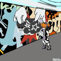
A TWEWY cutscene (Part 2??)
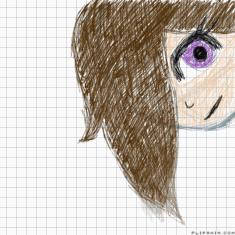
idk why.
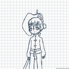
京剧猫【by欣蓝
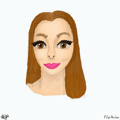
Practice

18 comments
Jilly06
20.05.2020 06:04
LinkWoah amazing!
ArtsyMe[OP]
20.05.2020 06:05
LinkThank you!
https://www.google.com/search?q=battle+angel&tbm=isch&ved=2ahUKEwib8q3n4sHpAhWOdHAKHdgNDvgQ2-cCegQIABAA&oq=battle+angel&gs_lcp=CgNpbWcQAzIECAAQQzIECAAQQzIECAAQQzIECAAQQzICCAAyAggAMgQIABBDMgIIADICCAAyAggAOgQIIxAnULIeWIcqYKEraABwAHgAgAH1AYgBkw6SAQUzLjYuM5gBAKABAaoBC2d3cy13aXotaW1n&sclient=img&ei=iMjEXpuOOY7pwQPYm7jADw#imgrc=RMyDl1wpgBMaYM
its reminds me of that
I’ll ignore what you said and I’ll helpfully criticise (;
you did a great job on the toning but what I would say is don’t be afraid to make some places even more dark, because if you looked in a mirror you would see how hard light hits and how intense shadows really are
and with the colours and textures, I see you put a ton of effort on texturing the hair and maybe try drawing a few strands of hair kind of outside the “blob”/shape of the hair ig
and also maybe add some slight freckles, when artists add freckles and other details it can really make a drawing hyper realistic, I also see that lots of people draw lips very pink, not sure if its lipstick or not but maybe make it slightly more peach and toned down
you did very well and it’s looking great so far, very above average I’d say lol
this probably took forever so I feel bad criticising so much lmao
One idea: search up proportions of faces. The eyes and mouth are a bit too big and the nose is a bit too skinny. There are some really helpful guides on the internet for proportions. I do agree with Floofery, you should add some loose hair strands and make it a have a bit more contrast. Otherwise, great job 👍

