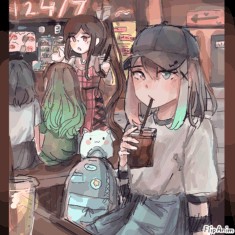
have this lmao

泰拉瑞亚邪月教主
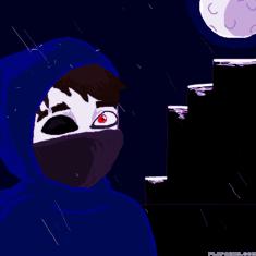
rainy night
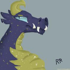
Tesla's fire
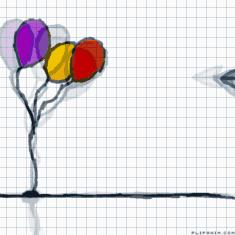
balloons :)

When you feel like having Pepsi Max a hot summer d
Untitled
Pride pfp, ft. Evergreen


12 comments
Pastaa-the-Nightwing
03.06.2020 02:02
Linkbeautiful! I also changed my pfp for pride!
Qinter[OP]
03.06.2020 11:43
LinkThanks! I like your pfp!
ok
i uh
get ready for me to be brutally blunt
Unless it's your style (which it probably is), try not to use those short lines to try and draw curves. It's known as "chicken scratches", and if you wanna become a better artist, you're gonna have to change. Another nit pick is the shading. I can tell you've shaded just a little bit, with black (or a darker colour of the main colours). NEVER USE BLACK OR A DARKER COLOUR OF THE ORIGINAL COLOUR TO SHADE. I REPEAT, NEVER, AND I MEAN NEVER, USE BLACK OR A DARKER COLOUR OF THE BASE COLOUR(S) TO SHADE. I often times use pink, red, a deep blue or yellow to shade. Try changing the opacity or tool to get the look you're looking for. Also, about the little bit of shading, I often times shade just to one side (so the light is coming from the right or left). Example A - https://ibb.co/N7GZHB3, Example B - https://ibb.co/dBXSRFv. Notice how the shading/lighting is only off to one side? Yeah that's basically what I do. I am trying to start shading in different ways,