
I'll judge your art out of 10

by:
TotallYEET 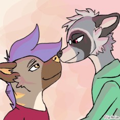 787
787
 787
787
03.12.2020

50 comments
fionadumbgg1alt3
03.12.2020 17:07
Linkme
TotallYEET[OP]
03.12.2020 17:10
LinkPlease leave a drawing or anim to check.

fionadumbgg1alt3
03.12.2020 17:26
LinkTotallYEET[OP]
03.12.2020 17:46
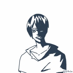
Link7/10
I can see where you were going with this.
For shading, I would have the character on a separate layer where it can not touch the background because it looks cleaner that way. The other thing is, you used a method of getting base shapes in different colors which is something I do. However the mistake I see is not having a brighter color and a darker color block for each part. That makes shading look smoother and easier to do.
Lastly, lower the opacity for all parts of the drawing. I know it takes more strokes and is more time consuming, but it reaps great results!
fionadumbgg1alt3
03.12.2020 18:05
Linktysm for the advice!!
RULES:
Be civil
Don't be butthurt over a low score
Leave an anim for me to check
Don't expect me to be an expert
Just be a good mature person is all I'm saying


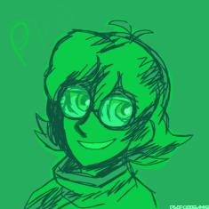
First one:
9.5/10
Ok, so I love it when things are smoothly shaded, and lines are a darker version of the original. The composition is great, and anatomy looks great!
Only thing I could say is maybe make the glass on the helmet look more gassy? I would add more dramatic and bold white lines for that, but that's my amateur ass.
Thanks! Yeah I did at one point think about the glass, but I wanted the shading on the face more noticable. Thanks for the feedback!!! ^^
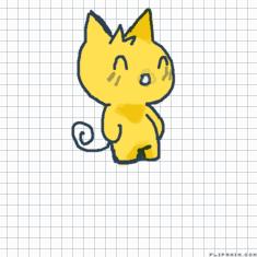
Second one:
7/10
You seem to excel with human characters over animalistic ones. The paw up front seems kinda whack IMHO, as well as some of the shading on the chest and paw.
It isn't a bad piece overall, but a few elements could be better.
My advice would be to try and make joints in the paws a bit more visible so it looks more structured.
Yeah, thats understandable. I'm not gonna make excuses but it was rushed for a custom, and I do prefer drawing humans more. I'm trying to start drawing more animals. Thanks for the advice, and not being one of those ppl who go "WOW ITS GREAT" this really helped!! ^^
Awww, np.
Also relatable asf.
Me: I want to improve my art because I'm dissatisfied with it. Could you random people give tips?
People: iTz PeRfEcT, Ur sO mUcH bEtTeR tHaN mE!11!!!
Me: Thanks Mr. Helpful
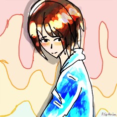
6.5/10
The shading is perfect, I'm usually not a fan of black shading, but you pulled it off!
However, the line art could be smoother, and so I deducted some points for that.
A suggestion if you're on PC. Zoom in on the anim and the website to get really small details in.
I'll bump that up to seven then, because wow.
Also, sorry about the shit Melly says about you.
*Virtual hug*

Comment removed
Comment removed
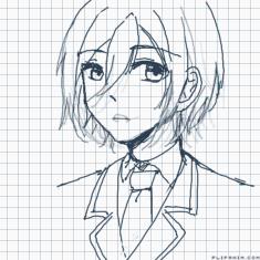
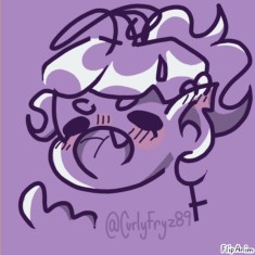
6/10
I think you are good at facial expressions, something I suck at entirely. However, the lineart could be smoother, and lots of the shading is kinda odd.
I would suggest shading in block like forms or using a less dark color for the roller brush in order to get smoother shading. As for lineart, practice is usually the key.
Oh you use opacity?
Then just lower the opacity and it'll be fine!

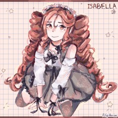
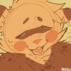
6.5/10
The facial expression is just adorable, and the shading is good in most places.
However, it looks like the quality declines the lower you go. The top looks great, but then some of the lines have weird dips and stuff. Also, they seem kinda thin IMO, but that may just be my preference for mildly thicker lines.
So I'd say take your time, and thicker lines for larger pieces.
my drawings on fa are bad lol
https://www.deviantart.com/lunareevee42/art/lighting-0-861893077
not trying to seem rude but... uhmmmm r u sure thats your deviantart? the styles are different. 😬😬
Comment removed
It is mine, I'm on a school Chromebook so I can't prove it tho qwq
Its also on scratch
scratch.mit.edu/users/-NixWasTaken-
All my drawings on fa are on Chromebook, that was drawn with a tablet
Comment removed
Comment removed
Eh, I won't debate things because I don't want a huge argument.
7/10
The shading is good, although having a teeny bit more highlight on the face would probably do it good. There are minimal nicks in the lineart, but that is more so a revision type mistake.
All in all, a good piece.

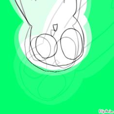
7/10
Edgy, but in a good way. The composition is great, but if there was one huge evil rabbit being in the middle, but cloaked in shadows, that would have been the dopest shit ever.
The background is amazing and the shading is pretty good.
Only things are anatomy and lineart. Take some time to study what rabbits look like IRL. The muzzles are less defined. As for lineart, like I've said before, take your time.
I said leave an anim attached. The pfp could change and the advice would not make sense anymore.