part 1
don't mess with fairy pokemon
exeggutor is so majestic
v
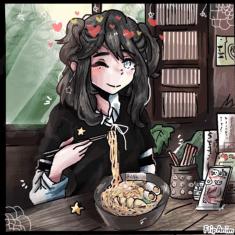
🍜-(-‿- )

Untitled
How FlipAnim Was Made....
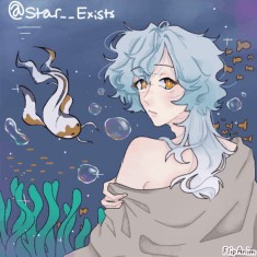
if u care enough abt my opinio


122 comments

--bee-[OP]
19.05.2024 10:41
Linkpost ur ocs below ill be honest tho
--bee-[OP]
19.05.2024 10:41
Linkalso ignor emy coloring for this i was testing stuff n i dont like it lol
--bee-[OP]
19.05.2024 10:43
Linkoof its dead on here lol ill come back to this
--bee-[OP]
20.05.2024 05:12
LinkHOLY SHIT GUYS


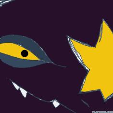
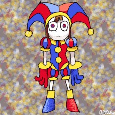
Overall, I like the style of this character. It's very cutsey and the outfit gives a kind of clown pin-stripped vibe.
The stars on the cheeks give a nice complimentary contrast to the muted purple in the hair
However, I think it's kind of hard to read if its a mask or her actual face. I can't actually tell. Maybe making it more clear if its a mask or not could help. If its not a mask, I'm not understanding why her face is black while the rest of her body is a peachy color. Also, the value contrast of the white collar and pale skin makes it kind of bleed into each other. I felt like I had to really look for it.
Also the beautiful silhouette of the dress is lost to the really long hair. You could definitely keep the hair long, but I wish the outline of the dress was more prominent because I think it's the strongest part of this composition.
Also I don't think you need the red. You could definitely keep it to a purple-yellow palette and be alright, but I get that a lot of clowns have the red nose.
6.5

Wish there was color. The silhouette could be stronger, especially with those horns on the hat.
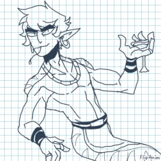
I like his facial structure and the asymmetry of the scar contrast to the symmetry of his whole outfit. I think it speaks to the character without ever explicitly saying anything.
I don't get the gas mask separated from the glasses. It seems like a modern interpretation on an army uniform, but it doesn't really read as an army uniform? More like a fashion statement. If the mask was combined into an actual WWII esque mask, I think it would read a lot better as a functional piece of equipment.
I also wish there were more nods to the ram horns on top of the hat. I think it would be interesting to see the contrast of war and the overall representation of sheeps/rams in art (innocence, softness, etc).
It feels like a work in progress and I wish there was more to critique because I really like the idea.
5/10
Also I'm as alright as I can be lol. Stressed asf but I appreciate ur concern <3
Comment removed
Ayo I didn’t expect this much detail- Prob means nothing though since it’s been a while but Hopfully your days become a lot easier in the near future. I dunno your exact situation but ik how much of a pain in the arse stress can be.
Also thank you! This was well written and I appreciate it, he is a work in progress I’m open to making any changes. (But ofc the hat idea is staying-) I’ll keep this all in mind when completing the design. And I dunno how far I should push the realism in the uniform since it’s more in a low fantasy setting but I’m gonna be testing that out.
You caught me lacking with this too- this was the time i disregarded character design rules and thought I’d get away with it. At least for the silhouette part I knew anyway. ⚰️


Values of the hair and tank top are the same, maybe make the tank top darker?
I don't understand the third eye. I like it a lot and it makes the character itself interesting, but when the glasses don't hit that third eye, it makes it not really functional. If it's not functional, that's another story, but as of right now, if reads that way. Maybe change the glasses to make a funky shape that has the third eye in mind? It would add to that kind of silliness of the character too.
I feel like you could do more with accessories in the character too. Maybe adding some silver jewelry or a jacket to make the silhouette more interesting.
I am such a sucker for braces in characters btw I love them to death.
I want more from this character so so badly because right now, it just feels like another art kid I would see in my drawing class.
5/10

I like his colors a lot. I want that muted red darker though. It would make the little butterfly on the shirt pop.
Also, I don't think you need those hearts as buttons. They could be that gold on the belt and it would make the design more cohesive. Other than that, I like the shirt design and the outfit is perfectly simple.
The blonde in the hair has the same value as the skin which makes me sad because I love the hair design. Also the random beauty marks make me kick my feet.
This style in general leans towards shape language and I feel like from this design I get a good sense of what this character is like. The expression does a lot and the blocky angular facial shape makes me think he's a stern but sturdy person.
Strong design. I wish I saw color in his eyes, but I think that's me *****ing about the style itself. I feel like the simplicity, albeit good, could be pushed a bit.
7/10

Firstly, gorgeous illustration.
This design reminds me a lot of that one mermaid-fish webtoon. The one with the shark boy with blue hair. That's not really a good or bad thing, but it does bare resemblance which might confuse some people.
The values are kind of similar, but the shading you did kind of separates the colors itself.
I can't tell if he's a fish or not?? I want to believe he is because of the surroundings, but if you just showed me this design, I don't think I would pick up on it. The design itself is overall simple and doesn't really say "aquatic" to me. Maybe the color of the hair, but even then it's a stretch.
I want more with the outfit. You could do a lot with the koi fish as inspiration for outfits/character changes.
But honestly, the design is nice, but it's way way too simple. Again, gorgeous illustration, but without the background, I don't think I would know anything about this character.
4/10

err i made him really simplified when i draw him on flipanim so people will stop associating me with my furry phase i had 2 years ago
lol gremlin guy
Uh this is a hard design to critique because it is literally just a doodle. It reminds me of a sub-species of goblins in D&D. They're red. i don't know much else about them lol
I like the big ears and little tuft of hair, but I think the tuft could be read as a tail just because of how it cuts off from the top of the head.
The big toothy smile is fun, but it also kind of looks like a collar. I'm not sure which it is, but if you round it more, it would look like a collar, and if you sharpened them, it would look like teeth.
Strong silhouette. I feel like if I blocked this in black I would still know it's your character.
I think you could make the pink more saturated just to make the white in the hair pop. Or maybe adding a color to the hair would help.
It's cute. Not much to critique but it's cute.
5.5/10
Comment removed


I mean, it's straight forward.
It's a lemon with legs.
It reminds me a lot of that one series with all the objects.
I feel like it's rubber hose-y. But I've seen this shit on literally every other object, especially with those old ass Pusheen comics.
It's boring. I don't think this is a serious entry, though.
2/10

This is less boring because it's some sort of organic object, but it just is weird??
This could be some cute little sidekick I think. The green gradient is so goddamn ugly though it looks like snot or a grass stain.
I wish the overall oc was more polished too.
Change the smile to something more recognizable. Demons as a whole are so versatile and this whole character just feels like you gave up.
I want something out of this character but again, I think this is a joke entry because of the composition.
3/10

This feels like the first real character I've reviewed from you. It has a legitimate pose and composition and doesn't feel like an object with a face slapped onto it.
The colors are not my favorite. The shadow of the green pants are very similar to the shadow of the shirt. Honestly, all the colors are kind of similar with little differences.
I wish the shirt had a cleaner and more unique design on it. The smiley face is a cliche and there are so many interesting graphic tee inspiration on Pintrest and other apps.
The outfit matches the kind of FNF vibe youre going for. I think you could make the pants more of an army-green cargo that kind of matches Boyfriend's pants. I want to see them go more over the shoes.
Also the hair has no real place it's coming from on the head. I like the spikes, but it feels random. I can't tell the texture of the hair either.
It's not bad, but I think the silhouette and overall design could give more about who the character is.
5/10

A bit confusing at first glance. I think it's just the composition of the piece. I can't tell if he has a body/face, but I'm gonna act like he has no head.
I think you can do a lot with the idea of just a face but having a top hat floating like there is a head below it.
He gives Bill Cipher vibes, especially the flipping off to the camera.
The colors naturally read as American because of the red, white and blue. Also I wish the outfit had more detail. I feel like the hat is very eccentric and has details but the outfit just falls short. Maybe an old timey tailored suit?
I think the expression reads that this guy is chaotic and evil. It makes sense and its a very expressive character.
5/10

Simple design. I think there's not a lot to critique here because of how simple it is.
I like the gradient you have up top showing the colors you use.
Strong silhouette, especially the big hat. I think it's silly.
You have a lot of information on the character in the side, but I don't get a lot of that from the character design other than "Easily annoyed" and "Introvert". But then again, the character itself is really simple.
I think you did a good job with what your base was. I don't know a lot about PNGtubers, but I would definitely see this character in the corner of a video. Only gripe is I wish you played with the bottom outfit more. Again, I think a simple suit would be fun for the outfit to contrast the big orange hat.
7/10

This guy looks like the last character. I can't tell if it is or not because of how ghostly this looks. I also can't tell if it's just a really blurred picture or he's actually transparent. For the sake of this, I'm acting like he's transparent.
I think the hat idea is an interesting motif to follow. I would look more into different types of hats because I think you could do something with maybe a sunhat with this character, or some sort of hat that resembles Christmas.
I like the antlers. I wish they were the same on both side, though. Also the color fo the hors matches the shadow of the hat which takes away from it. Either making the hat a different color or changing the antler's colors could help a lot. And you could make the antlers bigger for a more interesting composition.
Whenever someone does a shadow on the face with a hat, it adds mystery. But it's been done so many times before. I think it would be more interesting to see the face but it was covered by the brim occasionally. (cont

I don't know what species this is, but I kind of like it.
The ink from eyes is so edgy tumblr era that I kind of hate it. it reminds me of Eyeless Jack.
I like the complimentary color palette and i think as a silhouette, it's interesting. I want it to be more cohesive shape-wise, though. Like the feet and hair are kind of spiky but the ears are more circular. I think it could work if you committed to one or the other.
I don't understand the weird stains on their outfit. Also the dark purple with the dark text makes the text near unreadable. The medallion is interesting, but I want that gold to be the same color as the gold on the hairclip.
I wish it had more of a face, but that's just me wanting this to be more bunny shaped.
6/10

Another big hat man. More christmasy than the other antlers guy. I think the colors here are pretty good, but the skin could be a bit lighter to separate it from the red on the hat and body.
I think in this case, the cohesiveness in the outfit works because of Santa having a matching hat and outfit.
I am in love with the silhouette of this character. It's so strong and angular and his little eye roll makes him have such attitude. I wish the bow followed that sharpness.
Also, the candycane stripes on the bow could be pulled throughout the whole composition, or entirely omitted. I don't think you actually need it.
I like this character an unreasonable amount
8/10

Love the colors, but I want more of them. Also, the brown of the shirt blends into the skin way too much I thought she was shirtless. Maybe making that either darker/the skin lighter.
I think you could omit the gingerbread design on the hat if you added more of that white to the actual girl herself. Maybe a frosting-esque design on her pants or shirt.
The christmas belt itself could be a "frosting" belt that you see in gingerbread houses.
Speaking of gingerbread houses, you could pull a lot of shapes and interesting design aspects from from them. Like maybe her beret is a gumdrop and her pants have little candy buttons on them.
This character has a lot of potential and I like the initial idea.
6.5/10

Interesting concept that this normal dude is just a horror beyond comprehension. I eat that shit up everytime
He looks like Edd from Eddsworld in an orange hoodie, though. I've seen like 10 guys who look like this in public too. The design itself is not very interesting.
I think you could make him more uncanny in his initial design. For example, maybe making him smile a bit to wide or making his fingers a bit too long. You can keep him normal, but just make sure you add parts of him that are abnormal.
This could be an uncanny valley or Mandela catalogue if you kept working on it, but right now, it's just kind of a dude who can make a creepy face.
4.5/10
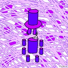
Unique idea. I like all the cylinders. Not so much the face.
I think you could definitely take a way the face, and it reminds me a lot of the other character you had on here. I don't know if there's a relation, but as a character on its own, they are interesting.
I kind of wish the face was more thought out and didn't touch the brim of the top hat. I like that its floating, but when the mouth and eyelids touch the actual forms, it takes away from that magic.
I also think making the arms two long cylinders instead of four separate ones could work. And the purples are really close. You could make the primary purple darker all the way around and it would add to the composition.
6/10
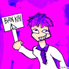
Ban Kai Furry lol
Lots of purple. I don't hate the pink highlights, but I wish the pink itself was more different than the purple. They're both super saturated and I wish the pink was less purply.
The stripped tie is interesting, but it matches the purple of the hair which is kind of strange to me. Also jsut the overall design is goofy but its almost too simple. I want more from it. Maybe some accessories other than the ban kai sign lol. Also I want color in the eyes instead of just black.
4.5/10

This is the fourth character you sent me that is just a white blob.
I guess it has more intrigue with the purple eyes, but it just makes me think of Toriel from Undertale. Especially the hanging hair that looks like ears.
It reminds me of Your Boyfriend too. The one purple girl.
There's nothing inherently unique about this design and it's just a floating head, so there's not much I have to go off of.
1.5/10

This is a nice design. It has a pleasing complimentary palette and it just overall is a fun character.
I think the outfit is a bit simple and could have more of a silhouette. Same for the hair. I want it to be even more spiky than it is right now.
She reminds me of a lychee fruit and I like it a lot. Also maybe adding some jewelery would help make the outfit more fun.
The eyes, outfit, and hair are all the same color. I wish the hair and eyes didn't match or were a different variation of the same hue. I just feel like it makes the character kind of unrealistic.
But it's a cute design. I can tell a lot about this character both from the posing.
6.5/10

Overall darker composition. I think you could make the red brighter.
The asymmetry in this design is interesting, but I don't think you need this much of it. It feels like the right side of the character is less visually interesting than the left. Maybe switching around where its asymmetrical to either symmetrical or adding visual weight to the right side would help a lot.
You had no way of knowing this, but I am an avid hater of the "X" eye. I think it's corny as **** and adds nothing to the character. I would change it to either a button if you're going for a stuffed-animal feel or make it an actual injury.
Also, I think you could lean into the old stuffed-animal idea by making the stitches go all the way around. You could maybe omit the stripes and make it patchwork instead.
You don't need the collar. It doesn't add anything to the design and it's confusing.
6/10
Cute little guy. I love the little pink bet straps. It adds so much to the character without doing too much.
The outfit isn't very practical and I think I want more of those straps on the outside of the jacket. You don't need the red of the X or the boots. You could easily make them that pink and stick wtih that kind of pink colors against the gray and black and be fine.
Also the fur on the jacket is distracting I don't think you need it, especially if you're going for a more sci-fi feel.
I like the gloves. I feel like this outfit is trying to be useful for combat, but it reads more as a fashion statement.
I would change the jorts to combat pants. The skin showing doesn't make a lot of sense to me.
The character itself with just the hair and pink eyes is alright. I feel like I could see a lot of characters with the same hair style and half face covering bang though. But I don't think it's that big of a deal and you could definitely leave that part of the design alone.
6.5/10

I think this is the same character????
With a clearer look, I don't like the weird collar thing. If it's some sort of shock collar, I would rather have it resemble that again.
Also I wish the outfit was more combaty. I think you could make the gray a chest plate instead of a tank top/bodysuit.
The heart eyes make me upset. It is so overdone and tired out. You don't need them to have hearts. Just make them pink

Unique shape. I like the hair its very goofy.
The outfit is interesting. I don't know how I feel about it because I think shape-wise, it's very cohesive, but there are aspects I think you can omit.
The teal things make it look like Hatsune Miku's uniform And you don't need the buttons to be triangles. They can just be buttons.
The orange arm band is confusing, but I don't hate it??? I feel like the bang going in the direction of the arm band makes you have more visual weight on the right side, so I would switch the arm or the bang to the left side to make it more pleasing.
You don't need the fingerless gloves.
Also the heart/thing on the cheek you could omit. I think the ****ass bob speaks for itself and I like it a ton.
Colors are very similar throughout which I wish was different. The shorts also make the outfit less cohesive. I wish they were more suit-esque and complimented the gray shirt. Also if you were to keep the cyan, it matches that light gray too much.
7/10
I kind of wish the hair was CMY instead of cyan, magenta, and green. I feel like if you switched the zebra stripes to a neon yellow, it would make the design more fun to look at.
The little O_O face is fun.
I wish the hair was even more spiky than it is right now.
Also I feel like with the scene aesthetic, you could add so so much jewelry. Like kandi bracelets or shutter-shades would look awesome on this character. I just kind of want more scene in this character because I'm a huge fan of that aesthetic and it has so much to offer visually
Also the shirt reminds me of a can of Rockstar Energy which I like lol the amount of patterns in this design really shows the eclecticism of scene.
I think this design is a good start but there can be more to it
7/10

I'm doing js the moonguy because I think the short one is just a little dude
Contrast of the face and feathers are too close together. Same with the outer color of the feathers and the robe.
Really strong silhouette. I like the robe a lot and the feathers on top. Reads as a holy figure and I think it references "Christ the Redeemer"'s pose.
I think you don't need the stars on the bottom because the face itself reads as a moon. Or if you keep those little stars on the bottom, I'd add them to the sleeves of the robe for continuity.
I like this. It reminds me a lot of the Moon that follows around ENA.
7.5/10
Comment removed


The all pink version is not my favorite because I'm such a huge fan of color and I don't think the style of the second picture holds the silhouette strong enough to stand on its own.
But as the character itself, it's very colorful.
The bandana matches the value of the bottom of the hair and so does the bottom teal of the ears. I wish the hair was jsut the pink because it kind of gets lost in everything.
Strong strong silhouette. Very spiky yet round. I like it.
I think you could simplify the shoes to match the simplicity of the head, but thats me being nitpicky
The stars don't read at all. I had to look like 3 times to see them. They're way too close to the green and I would either change it to a lighter yellow or omit them entirely.
Honestly, the biggest problem with this design is value contrast. Other than that, I think it's cute. It reminds me of Sonic
6.5/10
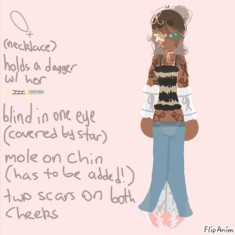
Star eye is confusing. I don't think it makes sense with the overall design even if she is blind in one eye. I'd rather see an actual eyepatch or nothing at all there. Or maybe a bow if you want to continue with that motif.
The contrast of this design is also incredibly low. Maybe pushing the colors outside of that pastel range would help.
I like the outfit, but I don't think the stripped green top matches anywhere. Same for the pink bows and shoes. It just doesn't seem cohesive
I like the jeans a lot i think it's the best part of this design.
If I were you, I would lean super hard into the bow idea and just add a bunch of pink bows. You could make the star a bow, the shirt more corset like and bow. I think if you lean into that coquette aesthetic more, it would be more interesting.
Also I would do more with the hair. From research, there are so many interesting hair textures and styles for POC. You could even incorporate the bow motif there.
5/10
Woah reading the other ones I see you are being like super no mercy and I’m so into that in doing this I wanna get destroyed
Name is Omicron but during the time of creation I didn’t had a name kxnsnx
And…
Just for the laught cuz I can’t take my character serious after all that had happened in that dnd game
lol i'm just trying to be as honest as possible
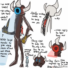
Eldritch creatures will always hold a special place in my heart so instantly, I like this idea.
However, the claw hands I don't think need to be a different color. It already kind of blends into the character's skin
I love how functional he is. You have a reason for everything you put on him. However, I think the big glowing eye is a bit weird. It feels like your overall design is like a natural creature I would find in the forest lurking, but then I see the eye and it makes it sci-fi.
Also the day form does not need to be there. I think it would be more interesting just to have him as he is.
The three horns would be more interesting if you maybe made it more like a rhino or three-horned animals just to add to that foresty feel.
I want claws on his feet too I feel like it would just make sense
One more gripe: I want him more hunched over. I feel like if I had an entire mouth on my back, I would be hunched. It also adds to the overall scary feel (co
Ngl you are so right, hehe, the light was just because I was in my sky cotl era and the krills in the game had the same light so I just slapped one into him, and the day form is actually for when I’m feeling too lazy to draw him fully hah
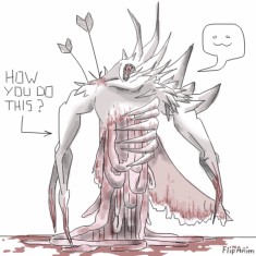
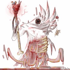
I am such a huge fan of D&D characters and gore and you mixed my two favorite things in one.
I think it's too complicated, specifically with the skin draping. I feel like if you were to keep it, you could make his skin like a cape of sorts covering his front ribs and guts, but if not, I think you can remove it.
Spikes are interesting, but I don't really get it that much. I wish the bone motif was up there with the spikes and maybe you played with the bones in the arms and neck.
Love the guts. Very nice contrast to the sharp shapes you have everywhere.
I can't tell if he's furry or not, but I like to think he's fleshy.
I would make the arms more stable to hold its weight instead of being straight spikes just for practicality.
I just want more out of the character because it has so so much potential to be an anatomical beast of nightmares. It's practically there already though. Also super good silhouette
7.5/10
YES he’s fleshy, and I have thinking for a long time how to add some clothes to it but I just haven’t really sit and think how it will look like, but I’m so into making the design worse (in a good way)
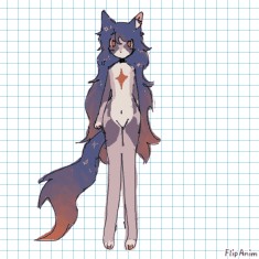
I'm so biased when it comes to your designs because honestly I love them all
I think this overall is a gorgeous design and you handled the gradient in the hair & tail well. Not only do you have a strong silhouette but it also has a very pleasing color palette.
I think the kind of muted purple is the only thing I would remove from the design. That and changing the star on the chest. I think the muted purple blends too much into the hair color and the star is a bit distracting. I feel like if you changed it so the star was kind of the same color as the belly and the bottom half of the star led into the crotch area, it would make it a more interesting composition.
I don't think you need the yellow star highlights in the hair or tail. Honestly, if anything I would make the hair a bit shorter so its more separate from the tail
Beautiful design. You have such a good knack for it and I genuinely wish I had it.
8.5/10
I like a lot of your designs ima have to try not to be biased lol
SNAKE WHORE
I wish there was color but that's just me complaining. Looking at the old color, I kind of see why you didn't add it. Blue Koolaid funny.
I feel like he reads as some sort of ancient civilization prince, maybe in the Amazon.
I don't get the necklace. I like how its realistic and drapes over the cobra-like plates on his back, but I don't thin you need it to be that big.
Black arm bands don't really add much to the design If you want to lean into the heavily jeweled prince aesthetic I would just make them gold bangles
I like how he has a little loin cloth lol
I think this is a good Naga Oc. And there are so many ****ing naga ocs. Very few things I would work on
7.5/10
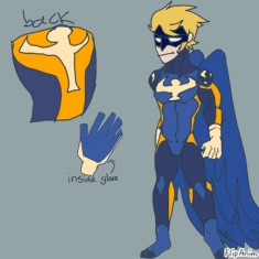
I condemn you for making a superhero with wings because ever since Hawks hit the anime version of MHA it has been the only thing anyone thinks of when they see a blonde superhero with wings. He feels like a mix of Hawks and Captain Falcon
But I love the colors on him. I want the blue on the suit to be different from the wings since it kinda bleeds into it. Also I would make the wings a bit shorter. It feels impractical.
I love the hooked nose on the mask. You could probably make the suit that dark black color
I like the symbol, but I would work on making it more closely associated with whatever bird he resembles. Right now, its the rough shape of a bird, but it doesn't really tell me anything else except he probably flies.
I like his spiky hair. His suit looks very action figurey which I also like. It also has a practicality that I think a lot of people miss when designing hero costumes.
8/10
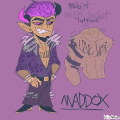
His alt outfit is just Valentino from Hazbin Hotel or that Purple Pimp dude I'm glad he doesn't wear it
I've wanted to say something on him for so long. I think he has so much potential to be a great oc. My main gripe is his tattoos
I want so much more detail in those tattoos. He reads as a very eccentric guy with how he dresses and his smug grin on his face. I think he would have matching tattoos. If you were to keep the "Love/Lust" thing, make it super detailed. Also you definitely do not need that dragon tattoo it adds nothing. You could keep it but I would move it to the leg since it makes his upper body look crowded.
His outfit is so good I think its cute. The dark purple of the flowers blends into the value of the pants, though.
I would poke the horns out a bit more, but that's just me being nitpickey. Also changing the gold to pop or just making more of his jewelry pearls would add a nice touch. You could play with designs on his belt buckel too.
8/10
Why blue?
i wish he was more of a natural cobra color because I think it would make it more realistic, but also it adds intrigue to the weird blue koolaid he's drinking. I'm kind of conflicted on if i love it or hate it
Blue kind of blends into the skin as well. I think that could work if you didn't have a harsh cut off and made it an ombre downward, but right now, it doesn't read that way.
I'd still make the bands bangles. I like that emerald green of the loincloth I would incorporate that color somewhere else
Same rating. That's all


info:
zombi it/its
green zombie cat i guess idk i made him in like 2021
The cat itself is kind of plain. I feel like the idea of a zombie cat has been done before, and I would love to see you play more with the idea. Maybe having a sand cat and making it a desert zombie or something.
The colors are alright but I think the green is way too saturated, especially if you're going for zombie.
I think what bothers me the most is there's nothing other than a small part of the brain being exposed and a small bone on the tail making the cat a zombie. If you take those away, I would think it's alien cat or just a green cat.
Cute idea though.
4/10
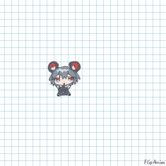
oh he is so cute i love him
I think this is a super solid design all around. The colors are nice and follow that kind of primary pattern you see in comics, and the contrast of the stark reddish-black is very fun.
Silhouette is ****ing amazing you can definitely tell what it is, especially with the posing in the reference.
If I'm being super nitpickey, I'd personally add more aqua and maybe not give the left side that little drip? I think that's just a sweat because I don't see it in the face reference in the moodboard, but assuming it is some sort of ink drop, I would omit that idea.
This character obviously has a lot of thought put into every minute detail. I like this character and I like its design. I honestly had to dig for something bad to say about it.
9.5/10
also yea that black drop is jus him being a nervous weirdo its not an actual part of his design
HEKLP i love that for him he could totally dominate the crime business


I think this is a Minecraft oc. If its not it looks uncanny to an enderman but I'm like 90% sure it is just an enderman
With that, I think it is just a mob with a hat and tentacles. I like the silhouette of them, but its kind of strange?? I think its the fact you have such a blocky character and then such an organic shape in the back
Hat adds individuality but its too close in value to the purple. Same with the pompom
I feel like you kind of slapped eyes on the tentacles to make them look cooler too.
This feels like you kind of got a preexisting template and added a few new customizations to it, but the customizations dont really add anything. It just kind of looks like an Enderman with a hat and some things coming out of its back
3/10